Service Desk Request Form Design: How to Reduce Clarifying Questions
Designing Service Desk request forms helps reduce follow-up questions: required fields, hints, dynamic blocks and quick validation before launch.
The problem: requests arrive incomplete
Most follow-up questions in a Service Desk are not because the user "explained badly", but because the form doesn't help them remember important details. People write what they see right now: "email not working", "computer is slow", "need access". Critical parameters remain off-screen: where exactly, on which device, what error, when it started, what was already tried.
Then the back-and-forth begins. A technician asks several basic questions, waits for an answer, gets part of the information and asks again. Each loop wastes time that doesn't move the resolution forward but only gathers initial data.
Missing data breaks deadlines and distorts priorities. Without a location and impact it’s hard to tell whether an incident "stops a department" or is a one-off minor issue. Without an error text it’s difficult to route the ticket quickly. Without a device model or asset tag you can’t prepare a replacement or dispatch, especially if there are multiple sites and heterogeneous equipment.
Requests where details decide everything suffer the most: access issues, workstation failures, network, printing and peripheral problems, and critical services. For example, in support that covers both workstations and servers, “won’t turn on” without an asset tag and address becomes a guessing game. If the data is collected right away, the path to a fix shortens immediately.
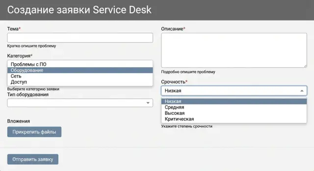
What a good request form should provide
A good form does two things: helps the user quickly describe the situation and gives the technician enough data to start work without extra questions. If after submission you often hear “please clarify…”, the form either collects the wrong data or overloads the user with unnecessary questions.
Rely on what is actually needed to start, not “just in case.” In most cases a clear minimum is enough: who is contacting, what is not working, where it happens and how urgent it is. Other fields should appear only if they change the initial steps or priority.
A practical basic set looks like:
- Contact and preferred way to reach (in case they miss a portal reply)
- One-sentence summary of the issue
- Context: location, device or service (room, branch, system)
- Urgency and impact: single person or department, is there a workaround
Some data is better collected automatically: the logged-in user, department, the standard workstation configuration, location. Leave the user only what the system cannot know on its own.
A simple filter for every field: if the answer doesn’t change the first 15 minutes of work on the ticket, it’s not mandatory. For the ticket “PC won’t turn on in room 312” the model or asset tag (if available) and urgency matter more than details like “when was the last service”.
Mandatory fields: how not to scare users away
Mandatory fields are needed not for discipline, but so the ticket becomes actionable. If a user sees a long form with red stars everywhere, they either abandon it or type anything to submit. You lose both quality and time.
How to choose mandatory fields without overload
A good rule: make mandatory only what the technician cannot start without. Not “it would be useful to know”, but “without this, start is impossible.”
Usually a short set is enough: contact, problem type, target/location (service, device, room/branch), urgency. Make “what was already tried” mandatory only where it truly affects next steps.
If a field is needed only occasionally, make it conditionally mandatory. Example: choose “Not printing” and mandatory fields like “Printer model” and “Room” appear. Choose “Access” and mandatory fields become “System” and “Role.” The user then sees fewer fields and fills them more accurately.
How to explain why a field is needed
People are more willing to fill forms when they understand the purpose. Instead of dry “Required field,” add a short hint: “Room is needed so we can dispatch without follow-up” or “Specify the system so the ticket goes to the right team.” This noticeably reduces questions in the first days after changes.
Hints and validation: so they fill it right the first time
The form should not only collect data but help the person fill it correctly. Hints and light validation reduce follow-ups because the user immediately understands what’s expected.
Show hints directly in the field: an example or short text next to the input. For example: “Device: laptop GSE L200, serial number is on the sticker at the back.” For many users this is faster than trying to remember “what identifier is needed.”
Use plain language. Instead of “CID/asset tag” write “Asset tag (usually on a sticker, 6–10 characters)”. If a field is optional, say so. If it’s mandatory — explain why: “Asset tag helps us find the device in the database and avoid follow-ups.”
Validation should be clear and friendly: what’s wrong and what to do.
- Bad: “Invalid format”
- Good: “Phone: enter 11 digits, for example 77011234567”
Set format constraints upfront: phone masks, a date picker, length checks for asset tags. Don’t hit the user with a dozen errors at once: validate as they fill and suggest one specific fix at a time.
Lists, templates and autofill instead of endless questions
When a ticket relies heavily on free text, technicians almost always need to clarify what exactly failed, where, on which device and how to contact. Many of those clarifications can be turned into tidy lists, templates and autofill.
Lists are helpful where classification is needed, not composition: request type (incident or service), category (email, printing, network, workstation), urgency and impact. This creates a common language for users and technicians and helps route tickets faster.
A description template works well for frequent cases. Instead of a vague “Describe the problem” show a one- or two-line structure: what failed, when it started, what was tried, how many people are affected. The user sees what matters and writes to the point.
Autofill reduces routine and errors. If the user is logged in, pull their name, phone, department and location. For workstation requests pre-fill the device from the inventory so model names and asset tags aren’t mixed up.
Be selective with attachments: requiring a file always is a bad idea, but in the right places it saves dozens of messages. Give clear hints: for a program error — a screenshot with the error text; for a printing problem — a photo of the printer display or a screenshot of the print queue; for a service outage — the time it stopped and what exactly is unavailable.
Dynamic forms: fewer fields, more accuracy
Dynamic forms are simple: the user first picks the request type, then sees only the fields actually needed for resolution. This reduces fatigue and improves data quality. It’s especially useful where many different scenarios exist.
For branching to be clear, start with 5–7 top-level categories and design a minimal set of follow-up questions for each. For example, for “Access” ask system and role; for “Hardware” ask type and asset tag; for “Network” ask room and what exactly isn’t working.
A simple guideline: on the first step show 2–4 fields that help classify and assign the ticket. Show the rest only when necessary. If a field rarely affects the solution, keep it optional or move it to a clarification step after the ticket is created.
There will still be category mistakes, so include a safe escape: quick option to change the request type, a hint “not sure — choose ‘Other’”, and for “Other” require a short description and, if possible, a screenshot or photo.
Step by step: how to improve the form without stopping work
You don’t need to redo the whole form at once. Smaller iterations keep users from getting lost and prevent a spike in errors for the support team.
Start by collecting facts from technicians. Ask them for a week or two to note why they ask follow-up questions: no room specified, missing serial number, unclear urgency, no screenshot, wrong branch selected. This quickly gives you a list of things that actually waste time.
Turn those causes into fields and short hints. If workstation tickets almost always need an asset tag, make it mandatory and add an example format. If people confuse “internet not working” with “site won’t open”, add a hint what to check and what to write.
A practical order:
- Pick one category with the most clarifications (for example, "Workstation")
- Rewrite the form fields according to frequent causes: mandatory fields, hints, simple validation
- Align changes with the service owner and security (what you can collect and what you can’t)
- Run a pilot and keep a fallback option for a short time
- Gather feedback from technicians and tweak wording
Common mistakes in request forms
The problem is usually the form, not the people. It either asks for too much or asks the wrong things.
1) Overloaded with mandatory fields
When too many fields are mandatory, users fill them “somehow” or abandon the ticket. Keep required fields to what’s needed to start: what happened, where, how urgent, and how to contact.
2) Vague field names and different interpretations
Fields like “Description”, “Details”, “Additional info” sound the same. The label should hint the expected answer: “What is not working?”, “When did you notice it?”, “What did you already try?”.
3) Categories used only for reporting
If a category is chosen only for statistics but doesn't affect routing, priority, or follow-up questions, it’s an unnecessary step and a source of errors. Categories should help route the ticket and open the correct fields.
4) Mandatory attachments everywhere
Requiring screenshots in all cases helps the technician but is often impossible for the user. Make attachments optional and give alternatives: “If possible, attach a screenshot. If not, paste the error text.”
5) Important data hidden “for support”
Sometimes fields are hidden because “support fills them anyway.” That misses the chance to get information right away. Anything the user definitely knows and can safely provide (device, location, room, service) should be visible and clear.
Quick checklist before launching an updated form
Go through the form as a regular employee: open it on a phone, fill it quickly and submit without asking colleagues. If at this step you want to write “urgent” or “don’t know” instead of an answer, the form either asks too much or doesn’t explain what’s needed.
Test 5–10 typical scenarios (printer, email, access, broken computer, new equipment request): can work start without clarifications? Each ticket should include: what happened, where, who is affected, and how much it disrupts work.
Then assess mandatory fields: each should have a short hint and an example. Remove duplicates like multiple fields “Description/Comment/Details”. Check routing and priority: the chosen category should lead to the right queue, and priority should use understandable options ("can’t work", "can work with workaround", "question") rather than obscure numbers.
Also test speed and mobile: the form should be fillable in 1–2 minutes, lists shouldn’t be endless and fields shouldn’t “jump”.
Real-world example: how one form reduces clarifications
In accounting, "printing stopped": documents don’t reach the printer, deadlines are tight, and a chat thread starts with “which printer? where is it? what does it show?”. A Service Desk ticket often reads: "not printing, urgent". Support spends time clarifying and may assign the wrong technician.
When the “Printing” category asks only the necessary facts, things change. A few clear mandatory fields are enough: printer model (preferably a choice from a list), room or location, urgency, what was already tried, and the error text (so the user can paste the message).
Then apply dynamics. If the user selects “printing fails on all printers”, the form asks about network and print account. If it’s “only one printer”, fields for device-specific details appear: indicators, print queue, paper jam, toner. Nothing unnecessary is shown.
Hints matter too: in the description field ask for a single phrase “what you did and what happened” and provide an example. Soft validation for overly short text can block empty tickets.
The result: the ticket goes directly to the right technician (network or printing), who already has model, location and initial diagnostics. Clarifications disappear from chats and resolution time drops without heroic efforts from support.
How to tell it’s working: simple metrics
The effect is visible not by feeling but by how much time the team spends on clarifications and reassignments. Two or three metrics checked weekly are enough.
Useful metrics:
- Share of tickets without clarifications: how many went into work without extra questions
- Number of messages before work started: if it drops, the form helps
- Share of reassignments and share of “Other” tickets: a signal that categories/questions don’t match reality
- Field validation errors: which fields are most often corrected or trigger validation
Once a month review 20–30 “heavy” tickets and note what was missing or unnecessary. If you have many types of equipment (workstation, all-in-one, server), compare errors separately: users need different hints.
Next steps: lock in results and scale
Start with one problematic category that generates the most clarifications and returns. Make the form simpler: 2–3 mandatory fields, one hint with an example, basic validation. That’s usually enough to see quick results and gain team buy-in.
Then assign responsibility: who decides on the form, who approves data requirements, who verifies that questions are clear for users. Typically you need a service manager, an implementer, security and a business owner. Without one of these roles the form will either become overly bureaucratic or won’t solve clarification issues.
After the pilot, scale changes gradually, one direction at a time. A comfortable pace is 1–2 forms per week so you can collect feedback and refine wording.
If a Service Desk or supporting infrastructure is being implemented or updated, involve an integrator early. For example, GSE.kz as a manufacturer and system integrator can help design processes and data requirements, select servers and workstations, and support deployment so the updated forms run reliably and without delays.
FAQ
Which fields should be made mandatory first?
Make only the fields mandatory that are required to start work: contact, what happened, where/with what (room, service, device), urgency and impact. Everything else should appear conditionally or stay optional; otherwise users will fill in anything just to submit.
What data is most often missing in Service Desk requests?
Location, the specific object (service or device), the error text and a clear urgency level are most often missing. Users write “not working” without saying where and on what, which leads to back-and-forth instead of fixing the issue.
How to tell if a form is overloaded and more harmful than helpful?
Use this simple rule: if an answer won’t change the first 15 minutes of work on the ticket, don’t make it mandatory. If a field is needed only sometimes, show it only for relevant categories so the form stays short.
How to explain to users why you ask for room or asset number?
Add a short hint right in the field that explains the benefit: “Room number is needed so we can dispatch without follow-up” or “System is required so the ticket goes to the right queue.” When people understand the purpose, they fill it more accurately and ask “I don’t know” less often.
How to set up field validation so it helps rather than annoys?
Use gentle, specific validation: say what’s wrong and how to fix it, e.g. “Phone: enter 11 digits, for example 77011234567”. Masks for phone numbers, date pickers and length checks for asset tags reduce errors without harsh “red” messages.
Where should I use dropdown lists and where allow free description?
Use lists where you need classification, not free text: request type, category, urgency, impact. Lists help route tickets faster and produce consistent data for prioritization and routing.
When is it worth using a dynamic form with branching by category?
Branching is useful when there are many scenarios and each needs different details. Let the user pick a category first, then show only the fields that matter for the initial troubleshooting — for example, printer model and room for “Printing”, system and role for “Access”.
Should screenshots be mandatory for all tickets?
Don’t require attachments for every ticket; users will either attach random files or abandon the form. Ask for attachments selectively and provide an alternative: if a screenshot is impossible, paste the error text or describe what’s on the screen.
How to improve a form without stopping work or causing chaos?
Collect facts for a week or two: have staff note why they asked follow-up questions (missing room, no serial number, unclear urgency, no screenshot, no branch selected). Then change one painful category at a time, run a short pilot and refine based on feedback to avoid a spike in errors.
Which metrics show that a new form reduces clarifications?
Track the share of tickets that entered work without clarification and the number of messages before work began. Also monitor reassignments and the share of “Other” tickets: increases mean categories or questions don’t match reality.