Prometheus + Grafana instead of commercial APM: metrics, alerts, SLO
Prometheus + Grafana instead of commercial APM: which metrics to collect first, how to set alerts without noise and how to agree SLOs with the business.
Why companies move away from commercial APM
Usually the trigger to drop a commercial APM is simple: cost grows faster than benefit. Licenses, per‑host or per‑telemetry volume fees, add‑ons for new modules — and monitoring suddenly becomes one of the largest line items in the IT budget.
The second pain point is opacity. When metrics, traces and alerts live inside a “black box,” the team struggles to understand why an alert fired, where a number in a report came from, and whether the calculations are trustworthy.
A third reason is data control. Not everyone is comfortable sending telemetry to an external cloud service, especially in the public sector and financial organizations.
Switching to Prometheus and Grafana changes the workflow. Developers more often think in terms of “what do we measure” and “which SLI reflects quality,” rather than “which button to press in the APM.” Operations gain control: collection, storage and aggregation rules become explicit and versionable. Support is usually easier too, if alerts and dashboards describe user pain (errors, latency, unavailability) rather than internal technical events.
In 2–4 weeks with reasonable effort you can typically achieve visible results: basic dashboards for services and infrastructure (errors, latency, load, resource saturation), the first useful alerts without a flood of notifications, and a common language with the business through simple SLOs (for example, availability and speed of key operations).
It’s important to understand the boundaries. Prometheus and Grafana are ideal when you need clear metrics, custom alert rules and data control. They work well on both Kubernetes and classic infrastructure: servers, databases, APIs.
Another tool may be needed if you want deep distributed tracing, code profiling, automated root cause analysis and rich analytics “out of the box” with minimal setup. In that case, the open source stack is often complemented by separate tracing and logging solutions, while Prometheus + Grafana remain the foundation for metrics and SLOs.
What you lose without APM and how to compensate
If you choose Prometheus + Grafana instead of a commercial APM, you get a strong metrics foundation, but some familiar features disappear. This isn’t catastrophic if you anticipate gaps and fill them with simple additions.
Commonly missing out‑of‑the‑box APM features:
- End‑to‑end request traces (where time is lost across services)
- Profiling (what exactly loads CPU or memory inside the code)
- Error analysis at the level of individual requests and users
- An automatic merged view of logs, metrics and traces
Business users usually don’t come for traces. Early questions are practical: is the system available, how slow is it, how many errors occurred, how long was the outage and who noticed the problem first.
You can compensate for many APM capabilities without complicating the stack if you focus on three signal sources: metrics, logs and minimal tracing.
A pragmatic starter set:
- Metrics: add a few key application indicators (latency, error rate, load) on top of infrastructure metrics.
- Logs: use a unified format (timestamp, service, request_id, level, message) and agree on what counts as an error.
- Basic traces: start with one critical scenario (e.g., authentication or submitting an application) and one correlation id (request_id) propagated across services.
- Incident context: an alert should state what exactly is “broken” for the user (e.g., 5xx spiked and p95 latency crossed the threshold).
Also agree boundaries of monitoring responsibility. Monitoring is responsible for early detection and a clear signal (what, where, how bad). It is not required to automatically explain the root cause down to a line of code. For root cause you need people, logs, sometimes a profiler and separate diagnostics.
A good realism check: can you answer three questions within five minutes of an alert — does it affect customers, is it new or recurring, and who should fix it (service, database, network, hardware)? If yes, the absence of an APM is manageable.
First metrics: 4 signals that give most value
To monitor with Prometheus + Grafana it’s convenient to start with four signals that almost always deliver quick value: latency, traffic, errors and saturation. They help answer the on‑call’s main question: is the problem in the application, a dependency, or a resource.
What to measure first
Latency. Measure where users actually feel time: at the API ingress (HTTP/gRPC), when processing background jobs and at key external calls (DB, queue, third‑party services). Averages are often misleading, so look at percentiles: p50 (typical), p95 (most issues), p99 (the painful tail). A single slow endpoint can hide in a service‑wide aggregate metric.
Traffic. Count business load: requests per second (RPS), number of jobs or messages, processed documents, transactions. Track both overall traffic and breakdowns by key endpoints or task types, otherwise a spike in one area will look like “everything is fine.”
Errors. An error is not just a 500. Track 4xx (often product or integration issues), timeouts, cancellations, retries, application exceptions and DB errors. Split by error types, not just “error=true,” so you know what actually broke.
Saturation. This is about whether a resource is near its limit even if it hasn’t failed yet. Watch queue lengths, connection pool fill, wait time in queues, CPU steal (important in virtualized environments), iowait and the share of busy workers. For example, a server may sustain RPS, but a growing DB connection queue and increased wait times foreshadow timeouts.
Labels without cardinality explosion
Keep labels minimal and stable so metrics remain useful and don’t overwhelm Prometheus. A good basic set:
- service (service name)
- endpoint or route (path template, without ids)
- method (GET/POST)
- status_class (2xx/4xx/5xx) or code if there are few distinct codes
- dependency (external dependency name: db, queue, auth)
Avoid high‑cardinality labels: user_id, request_id, full URL, error text. Those belong in logs and traces, not metrics.
Infrastructure: basic server and environment metrics
Without a commercial APM, infrastructure metrics are often the first to reveal what’s happening: a real load spike, an environmental fault or slow degradation. Collect the minimum that helps during an incident, not just nice graphs.
Start with four areas: CPU, memory, disk and network. For each, look for saturation indicators and latencies that directly affect users rather than generic percentages.
- CPU: per‑core usage, iowait (disk wait), run queue length (load). High CPU percent is not always a problem, while high iowait often indicates disk issues.
- Memory: available memory, swap usage and activity, major page faults. Low free memory can be normal due to caching; growing swap and faults more likely indicate leaks or insufficient RAM.
- Disk: free space, read/write throughput, latency, disk util, error counts. Incidents often start not with “0% free” but with rising latency.
- Network: inbound/outbound throughput, errors and drops, retransmits (if available), latency to key endpoints. It’s useful to see quality metrics, not just Mbps.
How to distinguish normal load growth from leaks or degradation? Compare “demand” and “saturation.” If traffic and CPU rise but disk latency and errors do not, it’s likely a normal spike. If load is steady but disk latency, swap or network drops gradually increase, that’s degradation. Memory leaks appear as monotonic growth in consumption plus increased swap or process restarts.
For VMs and Kubernetes add a layer that shows where the bottleneck lives. In virtualization pay attention to steal time (host taking CPU), storage pressure and noisy neighbors. In Kubernetes monitor not only node metrics but also requests/limits, restarts, CPU throttling and PVC disk state. Otherwise you may argue whether “we are out of resources” or “the app exhausted its limits.”
If sensors are available, power and temperature metrics often give an early warning. Overheating, failing fans or power issues can surface before services go down. This is especially useful in racks with servers and storage arrays where failures sometimes manifest as “strange timeouts.”
To make sites and teams look at the same thing, agree on a common dashboard format: identical panel names, unified thresholds and consistent labels (site, role, service). Comparing data centers, branches or clusters should take minutes, not hours.
Application and data metrics: what to add on top of hardware
CPU and memory explain "why the server is sick." More often you need to know: "why is the user slow" and "where the chain breaks." Add application and dependency metrics on top of infrastructure to find the root.
A minimal set is easiest to collect by layers — it simplifies diagnosis.
- HTTP/gRPC layer: request rate (RPS), error fraction (by code/status), latency percentiles (p95/p99), timeouts, response sizes.
- Queues and background jobs: queue length, waiting time before job start, retry count, fraction of failed jobs.
- Database: active connections and connection queue, slow queries (at least top by time), locks and waits, replication lag (if any).
- Cache: hit rate, read/write latency, fill ratio, evictions.
- Business metrics: 1–2 counters meaningful to non‑engineers, e.g., successful payments per minute or request processing time.
Small example: in a government application processing system API p99 rose to 5 seconds. Infrastructure looked normal. Metrics showed a growing background job queue and more retries, and the DB had more locks and increased replication lag. The chain was visible: background tasks accumulated, retried more, caused DB locks, and users experienced long waits.
To keep metrics from turning into noise:
- measure latency with histograms and watch p95/p99, not just averages
- limit labels (don’t add user_id, order_id and other unique values)
- separate user errors (4xx) from service errors (5xx) and timeouts
- measure dependencies (DB, cache, external API) separately, not only overall timing
This set gives enough visibility for diagnostics and for future SLOs: you can measure “successful and fast” from the user perspective, not just “server is up.”
Step by step: minimal Prometheus and Grafana setup
Start small, not with hundreds of graphs. The goal for week one: clearly see the health of the most important services and quickly catch obvious failures.
Pick a small set of targets: 5–15 components critical to the business. Typically ingress APIs, a queue, a database, key workers, a load balancer and a couple of critical servers.
1) Collecting metrics: the minimum that works
Make collection easy to maintain:
- Deploy exporters where they yield quick wins: node_exporter for servers, a DB exporter (e.g., Postgres exporter) and application metrics (HTTP, errors, response time).
- Configure service discovery where possible (Kubernetes, Consul, cloud tags). If not, start with a static list but decide who keeps it updated.
- Choose scrape intervals sensibly: 15–30s for user APIs, 30–60s for infrastructure, less often for slow systems.
- Agree on a common label set: service, instance, environment, team. Without this dashboards and alerts quickly turn into chaos.
Storage: start with Prometheus retention of 7–15 days and evaluate volume later. For long history add remote storage, but initially it’s more important to reliably collect and understand data than to keep it forever.
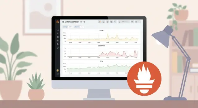
2) First dashboards and data quality checks
Create four simple screens: overview (all services), service view (one service in detail), infrastructure (CPU, RAM, disk, network) and a separate DB dashboard.
Before writing alerts, check data quality:
- are there gaps (holes often mean collection issues, not service issues)
- are units consistent (seconds vs milliseconds, bytes vs MiB)
- is cardinality exploding (labels like user_id or request_id shouldn’t be in Prometheus)
- do metric and label names match across teams
Example: for a rack of GSE S200 servers you quickly see that a complaint “API is slow” actually aligns with rising iowait and disk fill, visible on a single screen without heavy APM.
Alerts without noise: rules that save time
The main mistake is alerting on everything. A good alert doesn’t just say “something happened.” It says: “the user is being hurt, and this requires action now.”
Start with symptoms, not causes. Symptoms are user‑facing: rising 5xx, falling successful requests, higher latency, missed background jobs. Causes are CPU, memory, disk or network; there can be many causes for one symptom. So place first alerts on what’s visible from the outside, and use cause metrics as diagnostic hints in dashboards.
Set thresholds to reflect deviation from normal, not arbitrary “nice numbers.” Relative thresholds and percentiles often work better: e.g., p95 latency above usual level or error rate tripled versus the daily average. With SLOs, think in burn rate terms: how much of the error budget are you spending now. Alerts then fire on degradation speed, not single failures.
Short spikes shouldn’t wake people. Use time windows and delays: “must persist for 5–10 minutes” often removes most noise. For flapping metrics separate warning and critical alerts with different windows.
Prevent one incident from producing ten notifications by configuring grouping and deduplication in Alertmanager. Group by meaningful labels (service, cluster, environment), not by every pod or instance. One service outage — one message listing affected components.
Finally, every alert should lead to an action. A minimal runbook in the alert description:
- Check if users are actually impacted: errors, p95/p99, successful request rate.
- Look for recent changes: deploy, config, external dependency.
- Mitigate harm: rollback, disable a feature, failover to backup.
- Collect evidence for post‑mortem: graphs, logs, start time.
- If not resolved within 15 minutes — escalate via the agreed list.
This makes alerts rare, clear and useful, and on‑call less stressful.
SLOs with the business: agree without extra math
SLOs usually break on expectations, not graphs. The business thinks about customers and losses; the team thinks about metrics and logs. To agree, start simple: what must the user be able to do and how often must it succeed.
SLI in simple terms: what we measure from the user’s view
An SLI is one measurable thing that reflects user experience. Not “CPU 80%,” but “operation completed successfully and fast.” For most services a couple of SLIs suffice:
- Availability: fraction of successful requests (e.g., HTTP 2xx/3xx)
- Latency: fraction of requests faster than a threshold (e.g., 95% under 500 ms)
- Errors: fraction of 5xx or business errors (payment failed, order not created)
- Saturation: queues or timeouts that directly cause failures
Measure SLIs where it hurts the user — usually the ingress or key endpoint.
SLO in simple terms: what we promise and for which period
SLO is a quality promise over a period: “99.9% successful requests over 30 days.” The period prevents rare incidents from causing daily panic. For internal services a week may be enough; for critical external services use a month.
Then you get an error budget: the allowed portion of “bad” behavior. With an SLO of 99.9% you have 0.1% of requests allowed to be bad in the period. Explain this as a trade‑off: higher promises cost more time and money and make releases harder. If the budget is burning, the business chooses: freeze releases and fix stability or accept risk and some loss.
Translate SLOs into money and risk with simple questions: how much does an hour of downtime cost in sales, how many support complaints can be absorbed, are there SLA fines, what’s the reputational impact. For services with strict expectations (government, banks, clinics) it often makes sense to set a higher SLO for key operations rather than for everything.
Don’t overload the agreement: set 2–3 SLOs per service and define what constitutes an incident:
- availability of a key operation (over the period)
- latency of a key operation (percentile and threshold)
- time to recovery (e.g., 90% of incidents closed within N hours)
This is enough for the business to understand the cost of quality and for the team to set alerts and work plans without endless arguments.
Example scenario: from metrics to SLO and alerts
Imagine an internal employee portal for IT requests, HR forms and access management. Load is steady most days but spikes Monday mornings and at month‑end. The team wants to replace commercial APM with Prometheus and Grafana so the business understands what “normal” means.
Start with SLIs that reflect what the user sees. For a portal, three SLIs usually suffice:
- Availability: fraction of requests that received a response (not 5xx or timeout).
- Response time: p95 for a key operation (login, create request).
- Business success: fraction of operations that completed successfully in business terms (request saved, not just HTTP 200).
Then set monthly SLOs. Example: “monthly availability 99.9%, p95 for request creation under 1.2s, business success of request creation at least 99.5%.”
In Grafana it’s useful to show not only percentages but also “how many minutes can be lost.” For 99.9% in a month that’s roughly 43 minutes of allowable downtime. This makes it easier for the business: they see a time budget instead of arguing over percentages.
Now alerts. To keep Alertmanager quiet, use two levels: fast symptom and slow trend. Fast alerts wake people immediately when users hurt; slow alerts warn about degradation without noisy night alerts.
Example alerts:
- Fast: fraction of 5xx or timeouts for ingress and request creation > 2% for 5 minutes.
- Fast: p95 for request creation > 2s for 5 minutes consecutive.
- Slow: p95 growing week‑over‑week (e.g., hourly p95 above baseline by 30% for 2 hours).
- Slow: job queue or DB connection pool near limit for 30–60 minutes.
When an SLO is breached, the error budget concept kicks in. If the budget is consumed faster than planned (e.g., 70% used by the 10th of the month), decide in advance what happens next.
A common process:
- Freeze releases except for incident fixes.
- Plan tech debt work for 1–2 weeks (optimize queries, cache, limits, retries).
- Review alerts and dashboards: what didn’t help, what was excess.
- Return to feature development only after key SLIs stabilize.
This turns Prometheus + Grafana from a set of graphs into clear rules: what matters, how much can break, and when the team must stop and fix reliability.
Short checklist and next steps
After initial metrics and dashboards, quickly lock processes; otherwise monitoring decays into chaos and alerts become noise.
Launch checklist (1–2 days)
Check not only tech but responsibilities: who responds, who decides, who communicates with users.
- Collected the 4 signals for key services: latency, errors, traffic, saturation.
- Have 2–3 dashboards: service overview, infrastructure, dependencies (DB, queue, external API).
- Alerts configured only for user symptoms and resource exhaustion risks (with suppression and deduplication).
- Each alert has an owner and a clear first‑10‑minute action.
- On‑call schedule and escalation channel defined.
Incident checklist (first 15 minutes)
Start by asking: is this a single service issue or a broad infrastructure failure?
- What the user sees: increase in 5xx, timeouts, degraded speed, drop in business success.
- Where is the bottleneck: CPU, memory, disk, network, container limits, DB connection pool, queues.
- What changed: deploy, config, migration, load spike, provider outage or partner failure.
- What happens with dependencies: DB (connections, latency), cache, message broker.
- How to roll back and record: temporary mitigation (e.g., disable heavy feature), then capture root cause and add a backlog task.
Run a monthly cadence. Once a month review SLOs (are they too lax or unreachable), remove noisy alerts, check for label cardinality issues (especially user_id, parametric URLs, trace_id) and update dashboards for new dependencies.
When the stack spans multiple sites and teams, agree on standards in advance: common metric and label names, a shared dashboard template set, separate spaces per team and a clear alert catalog with owners.
The next step after the pilot often depends on platform and support: Prometheus, Grafana and metric storage must run reliably, so plan a robust platform and clear ownership. In such projects GSE.kz (gse.kz) can cover part of the "ground" — install S200 servers for monitoring and platform loads, and help with system integration and 24/7 support.
FAQ
What is the most common reason to abandon a commercial APM?
Most often the decision starts with a full cost of ownership calculation for a year: licenses, cost per volume of metrics/traces, extra fees for modules and telemetry growth as you scale. If monitoring becomes one of the most expensive items and doesn’t speed up diagnosis, switching to Prometheus + Grafana usually delivers quick gains.
What do teams actually gain by using Prometheus and Grafana instead of APM?
Prometheus and Grafana provide transparency: you can see which metrics are collected, how they are computed and what rules trigger alerts. This reduces mistrust in the numbers and simplifies post‑incident analysis because there’s less “magic” in the calculations.
How long does it take to get the first useful result after switching?
In a typical pilot, 2–4 weeks is enough to collect basic metrics for key services and infrastructure, build a few working dashboards and set up the first useful alerts. It’s faster if you pick the 5–15 most critical components in advance and avoid trying to instrument everything at once.
What do you miss without APM and how can you cover it at the start?
You often lose out‑of‑the‑box distributed tracing, code profiling and a convenient single view that ties logs, metrics and traces together. To compensate at the start: keep metrics as the foundation, standardize logs with request_id, and add tracing selectively for one or two critical flows.
Which application metrics should be collected first?
Start with four signals: latency, traffic, errors and saturation. These answer the main on‑call questions: is the user experience worse, where is the degradation, and is it the service, a dependency, or a resource issue?
Which labels are safe to avoid cardinality explosion in Prometheus?
Use only stable, low‑cardinality labels such as service, endpoint/route, method, status_class, environment and dependency. Do not add user_id, request_id, full URL or error text as labels—those quickly explode the number of time series and harm performance and storage costs.
How to configure alerts without noise and night false positives?
Alert on symptoms that hurt the user: increases in 5xx/timeouts, drops in successful operations, worsening p95/p99 latency. Keep causes like CPU, memory and disk as diagnostic hints on dashboards—alerting on them directly usually produces many low‑value notifications.
How to quickly agree on SLOs with the business without complex math?
Measure SLIs where the user actually experiences quality, typically at the API ingress or a key endpoint, and express them simply as “successful and fast.” Then define 2–3 SLOs per service over a period (usually a month) and agree in advance what to do when the error budget is burned so you don’t argue during an incident.
How long to retain metrics in Prometheus and when to consider long‑term storage?
Start with retention of 7–15 days so you reliably collect and understand data, then assess the real volume and the need for long‑term history. If you need long analytics, add remote storage later; at the start, data quality and consistent names matter more than keeping everything forever.
What to do if telemetry cannot be sent to the cloud and full data control is required?
If you cannot send telemetry to the cloud, deploy Prometheus and Grafana on‑premises to fully control collection, storage and access. For stable operation, plan reliable servers and support in advance—for example, rack‑mounted S200 class servers and 24/7 maintenance so monitoring doesn’t become a new single point of failure.