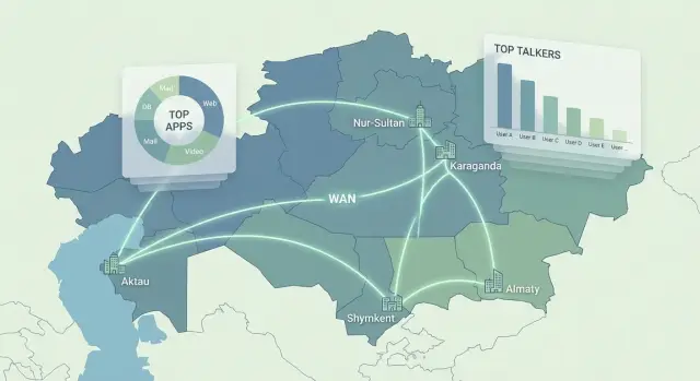
NetFlow/sFlow reports for branches: who "ate" the internet?
NetFlow/sFlow reports for branches: which widgets and views show top bandwidth consumers, applications and causes of slowdowns in 10 minutes.
What “who ate the internet” means at a branch
A typical scenario: people in a branch complain that “everything is slow,” but the link hasn’t gone down. Monitoring shows the link at 60% or 90%, sometimes packet loss, sometimes not. Email, ERP and video calls are choppy, and users are sure that “the internet is gone.”
The issue is that ping and interface utilization only answer whether there is a symptom. Ping shows delay and packet loss at a point, and an interface graph shows total volume. But they don’t explain who created the load, which application caused it, or where the megabits went.
When someone asks “who ate the internet,” you usually need to quickly break the situation down along four axes: who (device, user, subnet), what (application, port, protocol), when (exact window, spikes, recurrence), how much and where (volume, rate, direction, external address or internal server). NetFlow/sFlow reports exist precisely for that: they show not only “how much,” but “who and what.”
A simple example: a branch link is 50 Mbps, and complaints start every day at 10:00. From the interface it’s just a peak. From flows you discover one PC is pushing large uploads to cloud storage, and because of that voice and access to corporate systems suffer.
In the first 30 minutes of an incident, these questions matter:
- Who is top-1 by traffic right now and in the last 15 minutes?
- Which applications have grown the most compared to “same time yesterday”?
- Is this one “loud” host or many small sources?
- Is the traffic outbound or inbound (to DC, to the internet, to clouds)?
- Which services are critical for the business and how degraded are they?
If you can answer these quickly and clearly for both IT and leadership, you’ve found who “ate the internet,” not just looked at graphs.
NetFlow vs sFlow: what you get
NetFlow/sFlow reports answer a practical question: which devices and which “conversations” used the link. This isn’t eavesdropping on content, but accounting who talked to whom, how much data was sent and when.
NetFlow works with “flows.” A flow can be seen as a record of a connection: source, destination, ports, protocol, volume, time. Those records are convenient to aggregate into reports: top by traffic, by direction, by applications (if identified), by branch.
sFlow more often uses packet sampling: it takes every Nth packet and includes brief information. That gives a good overview in high-speed networks and on switches, but accuracy for small sessions is lower. For a “who filled the pipe” report this is usually fine, but for precise accounting of small flows it might be insufficient.
Why the difference matters:
- Flows are easier to aggregate and compare over time (before/after, peak hours, business hours).
- Packet sampling is lighter on equipment but can “hide” rare events.
- In both you see metadata (who, where, how much) but not the content.
Exports typically come from various perimeter and core devices. Common sources are: the router (sees all WAN egress), the firewall (sees policies and often users), and switches (see traffic through them, useful in large offices).
A separate topic is L7 application names (e.g., Teams, YouTube, cloud drives). Flow-only data may be insufficient: modern traffic is often encrypted and ports no longer reliably indicate apps. To show meaningful names in reports you need a classification source:
- DPI or App-ID on the firewall
- NBAR or similar on routers
- proxy / secure web gateway logs
- DNS and SNI correlation (not always reliable)
Simple example: a branch reports “slow internet.” Flow shows 60% of the link is used by one internal IP and several external hosts. To know whether that’s updates, video services or backups, you usually need L7 data from FW or proxy.
What data to collect so reports are useful
To make NetFlow/sFlow reports actually answer “who ate the internet,” collect a minimal but complete set of data. Otherwise you’ll get pretty charts but won’t be able to name an application, user or direction.
Start with the basic chain: exporter device (router, L3 switch, edge firewall), collector (where flows go), storage (how many days you keep history) and reporting dashboard. If you don’t have at least 7–14 days of history, you won’t know whether it’s a one-off spike or a new baseline.
Check critical fields before a pilot. Without them the culprit often stays anonymous:
- src/dst IP (who and where)
- src/dst port and protocol (type of traffic)
- bytes/packets (how much)
- time (flow start and end)
- interface and direction (ingress/egress, which link)
Then decide on accuracy. sFlow usually comes sampled, NetFlow is often more precise but heavier. A practical start is sampling 1:512 or 1:1024, check whether short but important flows (e.g., DNS) are lost, and only then increase fidelity. Flow timeouts matter too: too short fragments the picture, too long hides spikes.
Plan branch separation in advance. The easiest is to tie traffic to a branch’s WAN interface. If the network is more complex, tags like VRF, a clear addressing plan and consistent interface names will prevent mixing branches in reports.
Finally, agree on a “normal” baseline per branch. Fix typical-day baselines (weekdays, month-end) and set thresholds:
- average load and peaks
- top-5 applications by traffic
- share of “non-business” traffic
- acceptable growth (e.g., +20% over baseline)
Then, when a branch suddenly slows, you’ll compare with the baseline and spot deviations instead of arguing whether “it was always like that.”
Quick reports that find the culprit in 10 minutes
When “everything is slow” in a branch, don’t guess—narrow who, where and when the channel was used. Below is a set of NetFlow/sFlow reports that usually gives an answer in one pass.
5 reports to check first
Start with a fixed time window (e.g., last 30–60 minutes) and shift it to when users started complaining.
- Top talkers by volume and by rate (Mbps): shows devices that used the most and those that held the highest throughput. Often they differ.
- Top applications (apps or ports) with channel share: helps decide if it’s business load (CRM, updates) or non-essential (streaming, torrents, cloud uploads).
- Top conversations (client-server pairs): immediately shows who talked to which server and where traffic “flows.” Useful when one device talks to one external IP and fills the link.
- Utilization trend over time: per-minute link load shows when degradation began. This helps link a spike to an event (backup, update, report export).
- Inbound vs outbound: answers “downloading or uploading.” If outbound is high, look for cloud uploads, backups, video uploads, or remote desktop traffic.
After finding a suspicious host, clarify whether it’s a one-off or a recurring daily event.
Quick check: local or systemic?
If you have multiple branches, add a branch-channel view: compare utilization share and top applications per channel. This shows whether the issue is local (one office) or global (e.g., centralized updates started at once).
Mini-scenario: trend shows a peak at 10:15, inbound tripled. Top applications list HTTPS, and Top conversations show one PC actively downloading from one external IP. Next steps: confirm whether it was an update, archive upload, or video stream and take action: move to night, throttle, add exception, or change policy.
The main idea: one report rarely answers everything. Two or three reports from this set almost always converge to a clear cause.
Dashboard template for IT (operational)
An operational dashboard is not for show—it should let you localize overloads in minutes and choose actions: throttle a traffic class, temporarily block a source, reschedule a transfer, or open a separate link.
Top bar: “what’s burning right now”
Show channel status per branch in green-yellow-red. Next to it, show 3–5 recent incidents by impact: where there is loss, delay or utilization close to limit.
In the top bar include:
- In/Out utilization per branch and trend for the last hour.
- Loss and latency (if measured) and a “normal/bad” indicator.
- Top-risk branches: “link saturated,” “spike in new destinations,” “growth in real-time traffic.”
- Quick filters: branch, period, direction (to internet/from internet/inter-branch).
Main blocks: “who and what fills the pipe”
Then show two quick slices: top devices and top applications. Keep three time windows: last 15 minutes, 1 hour and 24 hours to separate one-off spikes from habitual load.
Add a conversations table sorted by bit rate and volume. Keep filters minimal: branch, source/destination, port or application, direction. Show both “top by volume” and “top by current rate”—otherwise nightly backups will look guilty during the day.
If you have QoS classes, show share of real-time traffic (voice, VTC) and what is displacing it now. That helps quickly decide what to throttle and what must be preserved.
Keep the “anomalies” block short so it actually works:
- sharp spikes relative to baseline (e.g., +200% in 10 minutes)
- new external destinations (not seen before in the branch)
- new services/ports or sudden application changes
- long “heavy” conversations (high rate for more than N minutes)
- schedule mismatches (e.g., backup running during business hours)
Short example: a branch turns red and in the 15-minute top appears one PC and application “cloud storage.” Conversations show one external IP holding 80–90% of the link. Action: temporarily throttle best-effort class, reschedule sync, check for new agent or update policy.
Dashboard template for leadership (executive)
Leadership needs a dashboard that answers three questions: where is there a risk to operations, how long does it last, and what’s the best next step. Technical details (ports, ACLs, queues) belong to IT; here show clear metrics and causes.
Block 1. Link status by branch (KPI)
Show a table or heatmap for all branches over a week and a month. For each branch 2–3 indicators are enough: availability, quality (loss/latency as an assessment), and number of incidents. Show sustained problems, not one-off spikes—for example, the branch was red 4 of 7 days.
Block 2. Link load and time “at the limit”
One chart per problematic branch: average load and 95th percentile, plus a counter of hours when the link was above a threshold (e.g., 85–90%). This moves the conversation from “sometimes slow” to “12 hours a week we operate at the edge.”
Block 3. Traffic composition by category (not ports)
Show shares: business apps, infrastructure (updates, backups) and “other” (video, social, unknown). This slice is usually based on classification in NetFlow/sFlow reports so leadership understands where bandwidth goes and what can be limited without harming operations.
Block 4. Top causes and impact
Display top-3 causes for the period with short explanations. Common causes: peak-hour overload, background updates, or backups during business hours. Show the effect: hours of degradation, number of affected branches, and which business processes suffer (POS, medical systems, ERP).
Below it, include a “decision block” with clear options:
- change policy (move updates/backups to night, limit “other”)
- increase the link (if business traffic consistently hits the ceiling)
- optimize the application (if one service causes spikes)
- enable controls (targets for next month: fewer hours at the limit, fewer incidents)
Example: a branch regularly exceeds 90% in peak hours 9:00–12:00, business apps are only 35% of traffic, the rest are updates and “other.” For leadership the simple plan is: first reschedule updates and limit categories, and only if KPIs don’t improve, discuss increasing the link.
Step-by-step: how to find the source of overload
When a branch is slow, pinpoint the 10–20 minutes when users complained. Then NetFlow/sFlow reports usually give an answer quickly and without guessing.
First select the branch (or the specific WAN channel) and a narrow time range. Use the time from helpdesk tickets, chat messages or app logs—for example, “Tue 10:40–11:05.” Open the link utilization graph and mark the degradation window: rise to 90–100%, spikes or a flat “plateau.”
Then work only inside that window:
- open Top talkers (sources and destinations) and Top applications for the selected minutes
- compare leaders by traffic and by number of connections: one heavy flow and thousands of small ones cause different issues
- check if the peak coincided with backups, updates, synchronizations, video surveillance or video calls
- filter results by interface and direction to find the choke point: inbound or outbound
When you find a suspicious source or application, drill into Top conversations. There you’ll usually see who talked to whom, to which networks and ports, and whether the load is legitimate. Example: one accountant’s PC uploads tens of gigabytes to cloud storage on 443, while an update server streams to all workstations.
Then check recurrence: was it the same yesterday at the same time and addresses? If recurring, the solution is often organizational rather than punitive.
Final step—record the findings in a ticket and agree on actions. Usually choose one of two:
- change priorities (QoS) or reschedule tasks to night (backups, updates)
- throttle or block specific traffic if it’s not business-critical
Common mistakes and traps in NetFlow/sFlow reports
The most common problem is not “no data,” but data collected so that you can’t quickly answer who filled the pipe and why. Then NetFlow/sFlow reports become pretty charts without action.
First trap—too aggressive sampling and too short retention. With heavy sampling you’ll only see large flows; small but continuous flows (updates, sync agents) get lost. If you keep detailed data only 1–2 days, you can’t compare “today” to “normal,” and recurring outages remain unexplained.
Second trap—no tie to branch and interface. If reports are collected “per device” or mix multiple WAN channels, you may misblame the wrong department or link. That leads to unnecessary calls to providers while the overload is on a backup link or an internal interface.
Third trap—looking only at Mbps. For voice and VTC loss, latency and jitter matter. Real case: link is 60% utilized, but users report robotic audio. The cause might be QoS queues or packet loss on the last mile, which a single Mbps graph won’t show.
Two more typical errors: no baseline and no clear application classification. Without a “normal,” every spike looks like an incident. And if everything is reduced to IP:port, even the true culprit is hard to explain to the business.
Check settings so reports don’t mislead:
- sampling and aggregation period suit your use case (short spikes are visible)
- retention allows 2–4 weeks for comparison
- branches, channels and specific interfaces are tagged
- besides throughput, loss and latency for critical services are visible
- applications are labeled with meaningful categories, not just IP:port
Short checklist: is your monitoring ready to answer in 5 minutes?
When a branch “loses internet,” there’s no time for long investigations. Good monitoring should show in a few clicks where the choke is, when it started, who and what used the link.
Check you can perform basic diagnostics without manual exports and complex filters:
- For each branch have two quick views: “top in the last 15 minutes” (for an incident) and “top in 24 hours” (for habitual load).
- One simple filter selects the right channel (interface) and direction: inbound or outbound. If this requires five conditions, you’ll lose time when it matters.
- There is a list of top conversations (who talked to whom) with the ability to immediately drill into the specific time, not just hourly averages.
- The graph shows the moment of degradation and the moment of recovery: to the minute, not just “sometime this morning.”
Also assess whether monitoring speaks business language, not just IPs and ports:
- Applications are shown with clear categories: mail, VTC, ERP/CRM, updates, cloud storage.
- There is a saved “one-page report” for leadership: what happened, which branch, how long, what traffic type caused it, what actions were taken.
If the answer to any item is “probably not,” improvements are usually simple: add ready-made views, pin filters by interface, set application categories and standardize the executive template. Then within 5 minutes you won’t have “seems someone is downloading,” but a concrete answer with time and facts.
Practical example: one branch, one culprit, a clear result
Morning, a regular workday. The branch reports ERP lag and broken audio in video meetings. Ping to the provider looks acceptable. You need not “it’s slow,” but who and what filled the link.
Open NetFlow/sFlow reports for the branch and narrow the window: a sharp rise in outbound traffic starts at 10:05 and returns to normal at 10:40. The WAN graph shows outbound saturation, so interactive apps (ERP, VTC) suffer first.
Investigation takes minutes: Top sources show one PC contributing the lion’s share of outbound traffic. In Top conversations for the problem window there are dozens of long sessions to one external IP on the same port with a steady flow. That looks like bulk upload or sync, not VTC or web browsing.
Record findings in simple facts understandable to IT and the business:
- overload interval: 10:05–10:40
- direction: outbound
- source: one PC in the office
- nature: long sessions to an external address
- impact: ERP and VTC glitches at the same times
The solution was ordinary: that PC ran daytime archive uploads to the cloud. They moved the task to night, applied a throttle for that traffic class and set an alert: “if one host holds > X% of outbound for N minutes.”
A week later the executive report showed a sharp drop in “hours of overload” during business time and ERP/VTC complaints stopped.
Next steps: how to implement and institutionalize the process
Implementation in 2–4 weeks
Start with agreements. If you don’t fix which branches and channels matter most, you’ll get many charts and few answers. Make a short priority list: key branches (by revenue or headcount), main channels (MPLS, VPN, internet) and business apps that mustn’t be disrupted (e.g., 1C, CRM, video conferencing).
Then define the required minimum reports. Usually two sets suffice: operational for IT (what’s happening now and who causes peaks) and executive for leadership (what harms the business, where to change or invest). Ensure these reports use the same logic across branches so comparisons make sense.
To make the process daily, formalize a short plan:
- fix priorities: branches, channels, apps, critical hours (e.g., 09:00–12:00)
- approve 5–7 mandatory metrics and reports for IT and leadership and who receives them
- set thresholds and alerts: traffic spikes, new destinations, anomalous growth in “unknown” apps
- prepare an action playbook: who handles alerts, allowed actions (contact branch, throttle a class, open provider ticket)
- introduce a rhythm: daily quick check (5 minutes) and a weekly review of causes and changes
Make it a habit
Weekly, pick one “noisy” branch and write a one-line conclusion: what happened, who generated it, what was changed. In a month you’ll have a catalogue of typical causes (updates, backups, cameras, torrents, cloud sync) and clear rules.
If you need infrastructure for a collector, storage and reporting, this often requires reliable servers and integration into the current network. For that task GSE.kz as a system integrator can help: for example, deploy servers for collection and storage (including the S200 Series) and support the solution in operation.