Monitors for bilingual documents: diagonal and scaling
Monitors for bilingual RU/KZ documents: how to choose diagonal, resolution and scaling so forms don’t shift and eyes tire less.
Why RU/KZ forms break on different screens
When people say a form’s layout “flows” or “breaks,” they usually mean simple but very annoying things: on one computer the document looks fine, while on another it suddenly doesn’t fit, table grids shift and line breaks appear where there weren’t any.
Most often it looks like this: labels don’t sit inside table rows, input fields are clipped or overlap, headers and footers shift, and in PDFs some text runs off the edge or becomes smaller. In web forms buttons and hints can start covering each other.
This happens with RU/KZ documents more often than with single‑language ones. The issue is rarely a “bad translation” and more often the length of words and the character set. Kazakh letters with diacritics (for example, Ә, Ө, Ү, Қ, Ғ, Ң, І, Һ) are sometimes rendered with a different font if the required typeface is missing. As a result, line heights change, spacing becomes inconsistent, and a tightly built table breaks. Also, bilingual forms are often designed in two columns or with parallel labels, so any change in character width is immediately noticeable.
The monitor and scaling settings directly affect the result. The same document on a 24" FHD and a 27" 4K screen is perceived differently because of pixel density and chosen system scaling. If scaling is set to make everything larger, the interface and text grow, but not all programs recalculate element sizes equally. Because of this, a form that fit at 100% may start being clipped at 125%.
Problems especially surface in everyday tasks: Word with tables and borders, Excel with print areas, scanned PDFs, web portals with forms, and 1C‑like interfaces with many fields and small labels.
If you’re choosing monitors for bilingual documents, think ahead not only about diagonal but about the scaling your users will use and how far they sit. Otherwise a “correct” form will look different for different people.
Three settings that solve 80% of problems
To make monitors for bilingual documents behave predictably, three things are usually enough: understand pixel density (PPI), choose appropriate scaling, and enable proper font smoothing. This is faster than endlessly fixing templates.
1) Diagonal, resolution and PPI (in simple terms)
Diagonal alone doesn’t make text more comfortable. PPI—how many pixels are packed into an inch of screen—is more important. If PPI is too low, letters look coarse and thin table lines and borders in RU/KZ forms may appear to “shake.” If PPI is high, text is sharper, but scaling is often required, otherwise everything becomes too small.
A simple rule of thumb: 24" with Full HD usually gives larger interface elements; 27" with QHD often looks sharper and more comfortable for tables; 27–32" with 4K almost always requires scaling.
2) Scaling: 100% vs 125% vs 150%
Windows scaling is not just “bigger font.” It changes the size of all interface elements: input fields, buttons, margins, labels. With unsuitable scaling, forms begin to flow: text wraps differently, table rows grow in height, and bilingual labels stop fitting.
In practice it often works out like this. 100% fits if text and icons aren’t too small and documents don’t use tiny fonts. 125% is the most common compromise for 27" QHD: eyes tire less and layouts break less often. 150% is often needed on 4K, but older applications can exhibit unexpected wrapping and jumps in element sizes.
If employees see the same template differently, first align scaling across all workstations.
3) Font smoothing (ClearType) and why “small” can look worse
On a large screen, small text may seem blurry if smoothing isn’t configured. Turn on ClearType and run its tuning wizard on each monitor type. This is especially noticeable on Kazakh text with diacritics: with poor settings the dots and tails can look messy.
Another often forgotten point is how you sit. Keep the monitor roughly an arm’s length away, with the top edge at eye level or slightly below. If the screen is too high or too close, even good PPI and scaling won’t prevent fatigue.
How to choose diagonal for forms and tables
Bilingual RU/KZ forms usually contain more text, longer column names and more footnotes. So screen size affects not only comfort but how often you’ll change scaling. And with scaling comes the risk that form elements will look different across employees.
24" works if you operate in a single window and tables aren’t too wide (roughly up to 8–10 columns with modest headers). It’s easier to keep the same scaling on 24" monitors. But when people habitually open a form and an instruction side by side, or two documents to compare RU/KZ content, horizontal space becomes tight. Then users more often enable 125–150% and constantly move the document around.
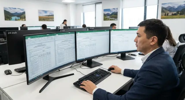
27" is a clear office balance: comfortable to read and often enough space to keep two windows side by side. For bilingual documents this is especially useful: form on the left, translation or terminology reference on the right, with less switching.
32" is good when users work with many tables, long lines and frequent data reconciliation. But there are nuances: at a close distance you’ll turn your head more, and at high scaling some of the area advantage disappears. This size suits those with deep desks who habitually sit further from the screen.
Ultrawide models help when you need 2–3 windows on one screen (form, mail, spreadsheet). But for some form types they get in the way: many templates assume a familiar width, and users start changing scaling and scattering panels. Also, people used to 24–27" will need time to adapt.
A quick guideline:
- 24" — one document on screen, minimal parallel tasks.
- 27" — forms plus a second window side by side most of the day.
- 32" — heavy spreadsheets and long lines, enough desk depth.
- Ultrawide — many simultaneous windows, but test templates first.
If you’re buying for a team, choose 1–2 standard sizes and fix a default scaling. That way templates will look the same across workstations and eyes will tire less.
Resolution: FHD, QHD or 4K for RU/KZ documents
Resolution matters not just for a “nice picture.” It influences how many rows and columns fit on screen and how Russian and Kazakh text looks in forms with fixed fields, borders and tables. In RU/KZ layouts small shifts are noticed immediately, so resolution is often a decisive parameter when choosing monitors for bilingual documents.
FHD (1920x1080): when it’s fine and when it’s cramped
FHD is usually comfortable on 22–24" if you work with simple applications, letters and don’t keep two documents side by side. On 27" FHD often produces large text and little space: tables run to the right and forms require more scrolling.
QHD (2560x1440): the sweet spot for 27"
QHD is often the most convenient option for 27" office work. More rows and wider tables fit on the screen without making text tiny. You can usually work at 100–125% and get crisp letters in RU and KZ, and a more stable appearance in Word, Excel and PDF.
4K (3840x2160): when it’s justified
4K makes sense if you choose 27–32" and genuinely use the extra space: long tables, side‑by‑side document comparisons, many fields in forms, working with PDFs without constant zoom. But 4K almost always requires 125–150% scaling; at 100% a 10–11 pt font becomes too small and tires the eyes. So 4K for “sharpness” without planned scaling often doesn’t pay off.
A quick check on a typical RU/KZ template:
- 10–11 pt text is readable at working distance without squinting.
- A table of 8–12 columns fits without horizontal scrolling.
- Print form fields and borders don’t shift at 100% and at your chosen scaling.
- Two windows (e.g., Word and PDF) really fit side by side.
- At 125–150% no important part of the form disappears below the screen fold.
If a team fills RU/KZ forms and tables all day, 27" QHD usually gives the best balance. Take 4K if you are ready to set scaling and test templates; otherwise the clarity gain will cost extra adjustments and fatigue.
Step‑by‑step: set scaling so layouts don’t break
If RU/KZ forms look different on neighboring PCs, scaling is usually the culprit. The same table in Word or PDF can spread because of different DPI, app zoom and browser settings.
5 steps to follow in order
-
Check Windows scaling: Settings → System → Display → Scale. Start with a baseline value (usually 100% for FHD on 24–27", 125% for QHD on 27"). Choose one value and avoid jumping between 100% and 150% without reason.
-
Tune text clarity. In Windows enable ClearType and run the wizard, choosing the most readable option. This especially helps Cyrillic where small letter parts can become smeared.
-
Remove double scaling. Open a template in Word, Excel, PDF and the browser and ensure that each app’s zoom isn’t compensating for Windows scaling. A good rule: Windows controls global scaling; keep apps at 100% and change only for a specific file if needed.
-
If you use two monitors, align DPI on both. Identical diagonals can still have different resolution and density. Ensure Windows scaling is the same for each display and that the primary monitor is set logically. Otherwise a window moved between screens will change size and table rows will jump.
-
Fix a reference and apply it across the department. Save a short instruction: monitor model, resolution, Windows scaling, default app zoom. New workstations can then be configured in 10 minutes.
Before you declare a standard, quickly test it on a real RU/KZ form: open the same file on two PCs and compare line breaks and table borders.
Often many small overlooked details break the layout:
- browser zoom (sometimes accidentally at 90% or 110%)
- PDF viewer’s "fit to width" mode
- Excel auto scaling when printing or in page layout view
- different drivers or color/profiles for the same monitor model
If you’re buying many screens, choose 1–2 standard "diagonal + resolution + scaling" bundles and repeat them. This is practical for procurement and integration where identical appearance matters.
Common mistakes when choosing and configuring
The most common reason RU/KZ forms flow is simple: people set scaling in two places at once. The result: a table sometimes doesn’t fit widthwise, then moves rows, then clips fields.
The first trap is mixing Windows scaling and app zoom. For example, Windows set to 125% while Word or the browser is additionally set to 110%. On one PC it looks tolerable, on another it breaks alignments, line spacing and row heights.
Second mistake: a 4K monitor at 100%. Text becomes too small, the user resorts to manual zoom, resizing windows and changing template fonts. A week later the department has several versions of the same form.
Third: different monitors in the same office. One person on 24" FHD, another on 27" QHD, a third connecting a laptop. Even with the same percent scaling, physical letter and line sizes differ. A template that fits on one machine may wrap Kazakh labels on another and expand the table.
Fourth: expecting “what you see on screen” to match print. Screens use pixels; printers use millimetres and margins. If a form must print precisely, rely on page settings and a test print, not just on-screen appearance.
Fifth: buying by diagonal only. A big screen won’t solve the problem if you sit too close, there’s glare or the font is too thin. For monitors used with bilingual documents the essential thing is that text is readable without strain and without constant zooming.
To avoid these pitfalls keep a baseline:
- agree on a single Windows scaling for the department and don’t touch app zoom without reason
- compare physical text size across workstations (not just percentages)
- test templates on two typical monitors and two apps (for example Word and PDF)
- do a test print and lock page margins and fonts
- consider distance and lighting, not just diagonal
A simple example: accounting prepares RU/KZ contracts. On 4K at 100% everything fits but is tiny, so someone sets Word to 120%. Later the same file is opened on a 24" FHD and signatures slip to the second page. Unified settings and a standard monitor almost eliminate such surprises.
Readability in RU/KZ: fonts, glyphs and tidy tables
The main reason a document looks tidy on one PC and falls apart on another is straightforward: different fonts, different rendering and different pixel density. For bilingual monitors this is especially noticeable because Kazakh characters quickly reveal font support issues.
Font and Kazakh letters: a one‑minute check
Start with the basics: the chosen typeface must correctly display Ә, Ө, Ү, Қ, Ғ, Ң, І, Һ. If you see squares, substituted characters or odd spacing, further monitor tuning is almost pointless—the problem is already in the document.
Then compare the same RU/KZ paragraph in Word and PDF. Sometimes Word looks fine while PDF strokes are thinner, spacing differs and a line no longer fits. This is usually font substitution or different smoothing. It’s a good sign when Word and PDF look similar: same stroke weight, similar text density, no fuzziness at small sizes.
Tables: where layouts most often fail
Tables in bilingual forms break more often than plain text because of long words, wrapping and automatic column widths. Test tables on real templates, not on a “perfect” two‑row example.
Before mass procurement or rollout, quickly check these points:
- wrapping inside cells and "eating" of borders
- row height changes when switching language (RU/KZ) in the same table
- auto column widths and print behaviour to PDF
- readability of thin lines and grid (they shouldn’t disappear)
- how the document looks at 90–100% view zoom
For an honest test do a 10‑minute check at a workstation: open a real form, fill a couple of fields, check numbers and names, save as PDF and review on the same screen.
Also address eye strain directly. If you want to zoom in or recline after 10 minutes, the issue is often brightness, reflections or low contrast rather than eyesight. Set comfortable brightness, remove window reflections and avoid „as bright as possible.“ For office work a standard refresh rate is fine; what matters is no perceptible flicker and that small text stays sharp during long sessions.
Example scenario: a team that works with RU/KZ forms all day
Imagine HR or accounting staff who fill and print RU/KZ forms all day: applications, employee cards, contracts, reports with tables and small text. Some employees have 24" monitors, others 27", and someone uses 32". The same form fits for one person and unravels for another: a Kazakh line wraps, signatures shift and labels move.
To choose a comfortable and predictable option, run a short test day with the team on the most problematic templates.
A 30‑minute micro test on real forms
Pick 2–3 typical RU/KZ templates that break most often: tables, long Kazakh headers and strict print fields. Compare them on different diagonals (for example 24/27/32) and in two modes: a single window full screen and two windows side by side (form and reference or registry).
Typical workflow:
- open problematic forms and check if line breaks and column widths change
- run "one window" and "two windows side by side" and see whether key fields are visible without scrolling
- pick Windows scaling so the form fits widthwise and text is readable without strain
- lock the chosen parameters as the department standard (diagonal, resolution, scaling)
Which solution is chosen in practice
People usually pick one of two compromises. First: 27" QHD, where 100–125% scaling is often enough so tables fit and text stays sharp. Second: 32" 4K, where 125–150% gives larger text without blurring, but you must ensure the form still fits widthwise at the higher scaling.
The key is not to choose what’s comfortable for one person, but to fix a single standard for the department and future purchases. Then new monitors and workstations won’t bring surprises: RU/KZ layouts remain stable and employees are less tired by the end of the day.
Short checklist and next steps for procurement
To avoid arguments and speed up decision making, answer two questions in advance: how far do people actually sit from screens, and which RU/KZ templates do they open most often (tables, applications, cards, print forms).
Quick size, resolution and scaling selection
A practical rule: the farther the seating and the more tables, the more important diagonal is; the higher the resolution, the more careful you must be with scaling.
- 24" — for small desks and 50–60 cm distance. Typically FHD at 100–125%.
- 27" — universal for forms and tables. Often QHD at 100–125%.
- 32" — when you need to keep two pages or wide tables visible. Usually 4K at 125–150%.
If users complain about small text, increase scaling first rather than changing template fonts. If layouts break, avoid mixing different scalings across similar workstations.
Pre‑purchase checklist before a large order
Before buying dozens of identical kits, take 1–2 test monitors for bilingual documents and run a short check.
- Open 3 typical RU/KZ templates (the most problematic) and verify line breaks, fields, table columns and labels.
- Check Kazakh characters (ә, ө, ү, ұ, қ, ғ, ң, і): they must be clear and not stick together at small sizes.
- Ensure at the chosen scaling (for example 125%) the required form block fits without horizontal scrolling.
- Test printing or export to PDF: screen scaling should not break the final document.
- Lock settings as a standard (resolution, scaling, ClearType, default zoom in office apps and browsers).
Then agree the standard with IT and form owners and make a short user memo. If you need to quickly standardize a fleet with supply, setup and support, it’s convenient to do this with a system integrator and the manufacturer, for example GSE.kz.
FAQ
Why does the same RU/KZ form “flow” on different computers?
Most often the cause is different Windows scaling and zoom settings in applications. Even a small difference—like 100% on one PC and 125% on another—changes row heights, paddings and field widths, and the template starts moving text and breaking tables.
Why do problems occur more often in bilingual RU/KZ documents?
Kazakh letters with diacritics can be rendered with a different font if the chosen typeface doesn't support them or is substituted. That changes character widths and line heights, and tables that were fitted tightly stop aligning correctly.
What should I do first if forms look different for different employees?
First, align Windows scaling across all workstations and agree on a standard value for the department. Then check that Word, Excel, the PDF viewer and browsers use 100% zoom and are not "compensating" for system scaling.
What diagonal and resolution combo usually works for RU/KZ forms?
A common, predictable choice for most office RU/KZ forms is 27" with QHD and 100–125% scaling. If you choose 4K, you will almost always need 125–150%; otherwise text becomes too small and people start using manual zoom.
When is 24" enough and when is it better to get 27" right away?
24" is fine when you usually have a single document open and tables are not very wide. If you often need two windows side by side (form and translation, form and registry), 27" usually reduces the urge to constantly change scaling and move content around.
Does it make sense to get 32" for documents, or will it be inconvenient?
A very large screen at a close distance forces you to move your head more, which is tiring. 32" makes sense when you really need long lines and wide tables and you can sit farther back with a deep desk.
How can I quickly check that a new monitor won’t break form layouts?
Set the chosen system scaling and enable ClearType, then open a typical template and check that captions and fields fit without wrapping. Also check the same document in PDF—font substitution and different rendering often change line widths.
Why enable ClearType and why is it noticeable on Kazakh text?
ClearType makes small text more readable and reduces ‘noise’ on thin strokes, which is especially noticeable on Kazakh diacritics. Run the ClearType tuning on each monitor type because perceived sharpness depends on the panel and pixel density.
Why not just increase zoom in Word or the browser if text is small?
Double scaling is the usual culprit: Windows percent plus zoom in Word/browser, or "fit to width" in a PDF viewer. Start with a single scaling source (Windows) and keep applications at 100%, changing them only when a specific file needs it.
How to standardize monitors and settings so you don’t end up with many template versions?
Fix 1–2 standard bundles: model of monitor, resolution, Windows scaling, default app zoom and test them on the most problematic RU/KZ templates. If you need a quick rollout of a unified workplace standard with supply, setup and support, it's convenient to work with the manufacturer or a system integrator, for example GSE.kz.