Monitor calibration for printing and presentations: minimum steps
Monitor calibration for printing: a minimal workflow and sensible frequency to keep color stable for layouts and presentations.
Why calibrate if the monitor already shows an image
The monitor does show an image. The problem is it shows it its own way. You adjust a file until it looks good on your screen, then the print comes out different: faces shift toward red, gray turns greenish, and dark details "stick together."
The same goes for presentations. On your screen everything can seem bright and high-contrast, while on a projector or in a meeting room colors may look "overcooked," white leans yellow, and shadow detail disappears. Often it’s not a "bad projector" but differences in how devices interpret color and brightness.
Calibration isn’t about perfection, it’s about predictability. Even without expensive gear you can keep basic things under control: a sensible brightness (so layouts aren’t too dark or too light), a neutral white (no obvious blue or yellow cast), visible shadow and highlight detail, and stability "today and next week."
A reasonable result for office tasks is when the same file looks similar on your monitor and your colleague’s, and the print "mostly matches" with no surprises: skin doesn’t become brick-red, a background doesn’t go muddy, and you don’t need 3–4 test prints.
A simple example: you make a certificate with a beige background and a logo. Without setup the background looks almost white, so you boost the color, and the print ends up darker and "warmer" than intended. After a basic adjustment you see the real density at once and make fewer corrections.
Basic concepts: calibration, profile, lighting
People often confuse calibration and profiling, though they’re different. Calibration is bringing the monitor to predictable settings (brightness, white point, gamma) so it behaves reliably. Profiling is measuring how the monitor displays colors after that setup and writing that behavior into a profile file.
Room lighting matters more than you might think. Bright surroundings make you raise monitor brightness, so prints look darker. In a dark room you lower brightness and make the screen appear too light. For stable results consistent conditions matter more than perfect numbers: the same lighting, the same screen brightness, no sunlight on the screen and no big shifts during the day.
An ICC profile is a file that describes the monitor’s color so applications can translate colors between devices (monitor, printer, projector). It doesn’t "improve" the image by itself but helps software show colors closer to the source.
An ICC profile is used in graphics apps and viewers with color management, in system display settings, and in printing workflows so the screen and the printer "speak the same language."
Why can two identical monitors look different? Even within one model panels and backlights vary, plus age and usage matter. One display may have been run at high brightness for years, another kept in a dim office. So copying on-screen settings won’t guarantee identical color.
When calibrating for print, think of the chain: monitor + room lighting + the app you view the layout in. When those three are stable, color stops "floating" even without expensive solutions.
Preparing the workspace and monitor before setup
Before calibration remove factors that make color wander even with correct numbers. Often the issue isn’t the profile but the environment.
Let the monitor warm up for 20–30 minutes. Backlight and brightness stabilize in that time. Calibrating immediately after power-up may lead to a different result an hour later.
Disable settings that alter the image on the fly. Auto brightness, ambient light sensors, dynamic contrast, "skin enhancers," movie/game modes and any auto-modes are best turned off. These effects may look attractive for presentations but harm color consistency: the same image will change depending on the scene and room lighting.
Next — signal and resolution. Connect the monitor digitally (HDMI/DisplayPort) and use native resolution and refresh rate. If you use an adapter or nonstandard cable check there’s no blurring, flicker or strange gray tint.
Keep room lighting even: remove direct reflections from windows or lamps and don’t place the screen opposite a bright light source.
Short prep before calibration: clean the screen, fix room lighting (don’t change it while working), position the monitor for a straight-on view, close colorful wallpapers and use a neutral desktop background, disable night mode and blue-light filters.
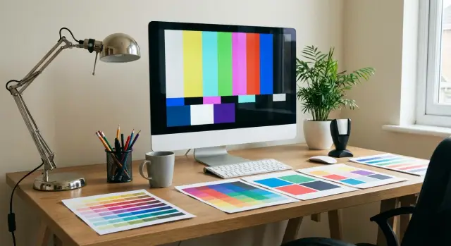
Minimal target settings that usually work
If you want a stable image without long experiments, pick a few simple targets and stick to them. The result will be repeatable rather than "different every time."
Brightness: logic over exact numbers
The main mistake is making the screen too bright. Photos and layouts then look "juicy" on-screen but print darker.
A simple guide: the white background on the screen should look like a normal sheet of paper in your workspace light, not like a lamp. If you print often, err toward slightly darker than "store display."
For presentations in a bright meeting room a higher brightness is usually appropriate so the image doesn’t look gray under overhead lights. But if you prepare both print and projection, find a compromise and check key slides on the projector separately.
Color temperature: D65 vs D50 in practice
D65 typically suits screen tasks: presentations, web, documents and most office settings. D50 is chosen more for print when you compare the monitor and print side-by-side under warm "print shop" lighting.
If you have regular office lighting, start with D65. Move toward D50 only if you constantly match prints side-by-side and see the monitor clearly cooler than the print.
Gamma and black point
For most tasks leave gamma at 2.2. It’s the most predictable choice for photos, graphics and presentations.
Black point matters for shadows and charts: if it’s "crushed" dark details merge and charts lose subtle differences between similar tones. Quick check: open a dark photo or a slide with dark grey blocks and ensure you can see several adjacent dark steps, not one solid blotch.
Short example: preparing a report with charts and photos for print and a talk. If the screen is too bright and black looks "dead," you’ll brighten shadows and push contrast higher, leading to muddy dark areas and "overstressed" charts in print. Clear target values help avoid that before fine profiling.
Minimal process without a colorimeter: step by step
This won’t make the monitor a reference, but often gives stable color for office printing and presentations — useful if you don’t want to buy a device.
First, enable color management in the OS and use the built-in calibration wizard.
In Windows open "Color Management," select the monitor, enable profile usage, then run "Calibrate display color." In macOS go to System Settings → Displays → Color → Calibrate.
During the wizard follow simple goals: neutral grays without tint, smooth gradients without banding, readable shadow detail. Set brightness so white doesn’t "glare," and you can see 2–3 lightest and 2–3 darkest steps on a gray scale. If a black patch is all merged, brightness is too low or black is boosted. Keep contrast near factory "mid" (often around 70–80% or default): too high contrast kills highlight detail.
Use test images: gray scales, gradients from black to white, solid color patches (red, green, blue) and a photo with skin tones. Visually the most obvious problems are banding in gradients and color casts in gray.
To repeat results, lock settings and mode: use the same preset (e.g., Standard/sRGB) without Dynamic/Game/Movie, fixed brightness (don’t change it per task), consistent room lighting (no sun on the screen), and disabled night mode and auto-brightness.
If gray drifts warm or cool after a week, rerun the calibration wizard and update the profile. For many office displays this is normal.
With a colorimeter: short process and reasonable expectations
A colorimeter doesn’t give perfect colors forever; it gives repeatable results. This is very helpful for print: you’ll more reliably hit expected brightness and neutral grays, so fewer test prints and fewer arguments about whose monitor is "correct."
It pays off where color impacts money or deadlines: design teams, print shops, marketing departments with recurring layouts, product catalogs. If you print once a month a colorimeter is still useful, but the return is smaller.
A quick calibration usually takes 10–20 minutes per monitor: warm up the screen, choose targets (for example D65 and gamma 2.2), set a comfortable brightness, run the measurement, save the ICC profile and assign it in the system. After this don’t manually tweak the image, or the profile loses meaning.
Frequency depends on usage. For office and presentations recalibrate every 2–3 months and after notable lighting or driver changes. For regular printing recalibrate every 3–4 weeks and before big runs. For daily color work recalibrate every 1–2 weeks and after moving workstations.
When choosing a practical colorimeter focus on support for your panel type (IPS, VA, OLED), easy-to-use software, brightness and white point measurement, and the ability to move the device between workstations — not on the maximum number of features.
If you don’t have a colorimeter but need consistent color across a team, agree on a common "standard": same brightness and temperature, same lighting at desks, one control monitor for final checks and one standardized test file for comparisons. This won’t replace measurements but will reduce variation.
Connection to printing: what to check so colors match more often
Even a well-calibrated monitor can’t save results if the rest of the chain is handled haphazardly. Stable output follows a simple logic: monitor with correct profile → software with color management → printer/profile for the press → chosen paper.
Most important: printing is not just the printer but the combination of printer + paper + mode. The same printer model needs different ICC profiles for matte and glossy paper. If the profile doesn’t match the actual paper, colors will shift: skin goes brick-red, gray turns green, deep shadows crush.
Soft proofing helps you catch this early. It’s a mode in graphic apps where the screen simulates a print with a specific profile. It won’t make the monitor behave like a printer, but it honestly shows what lies outside the printable gamut and where detail will be lost.
Before sending to print check a short list:
- the system uses an up-to-date ICC monitor profile;
- the application has color management enabled;
- the print profile matches the specific paper or the printer’s service;
- avoid double color management (either application or printer driver, not both);
- review soft proof and warnings about out-of-gamut colors (if available).
How to talk to a print shop without arguing: instead of saying "your colors are wrong" ask which ICC profile and printing standard they use (for example for coated paper) and in which form they need the file (PDF/X, embedded profile, rendering intent).
Example: you print a presentation booklet and soft proof shows your brand blue darkens. It’s easier to lift the tonal value a bit and do a test print on the same paper than to argue after the run.
Common mistakes that make color drift
The most common cause of drifting color is simple: the monitor is too bright. On-screen everything looks punchy, but prints come out darker and muddy. For print work comfortable brightness is often noticeably lower than the out-of-box setting, especially if you work in a dim room.
The second trap is switching picture modes. Movie, Game, Vivid, dynamic contrast, skin enhancement — all change tone, gamma and saturation. You end up making edits that only look good in one mode, and the next day someone accidentally uses another mode and sees a different image. For predictable color pick one neutral mode and keep it.
Another problem is mixing adjustments from different places. You tweak color in the monitor menu, enable night mode in the OS, then the GPU driver adds "enhancement," and the app applies its profile. In such a chain it’s hard to find the real cause of a shift.
If color starts to wander, do a quick checklist: are enhancements enabled in the monitor (dynamic contrast, auto brightness), is night light or blue filter on, did the GPU driver switch to a "video/boost" mode, did the ICC monitor profile change, and is the file opened in an app that ignores color management?
Finally — judging color under different lighting. Morning daylight, warm evening lamps and a dark wall behind the monitor change perception of white and gray. Example: you checked a layout by the window in the morning, printed it at night under warm light and blamed the print for "going green." Often nothing "moved" in the device; the viewing conditions changed.
If you need more stability, keep the same lamp (at least one consistent light) and a neutral area around the screen.
Frequency: a simple schedule you can stick to
Stable color comes from habit, not a one-off fix. The good news: most of the time a schedule that doesn’t annoy anyone and takes minutes will do.
If you want predictable print and don’t plan to dive deep, keep this rhythm:
- weekly: a quick visual check with a familiar image that has gradients and neutral grays (look for banding, color casts, crushed shadows);
- monthly: check brightness and room lighting (often the environment causes drift);
- every 2–3 months: update the profile if you have a colorimeter;
- after any change: recheck after OS or driver updates, cable/port changes, or moving the monitor/workstation.
Example: a designer notices a slight green cast in a gray fill once a week. Instead of a long search, they first check lighting and find a new desk lamp is the cause. It’s cheaper and faster than endlessly tweaking settings.
Main rule: don’t chase perfection daily. If the image is repeatable and screen-vs-print differences are predictable rather than random, the schedule works. If changes become sudden and large, run an unscheduled check and, if you have a colorimeter, recreate the profile.
Short checklist: 5 minutes before an important print or presentation
You don’t need to redo everything before a big job. The goal is to confirm the monitor is in its usual mode and color hasn’t drifted because of a small change.
First check the hardware and mode: the monitor is in the chosen neutral mode (not Movie, Game or Dynamic), brightness is at the usual level, and color temperature hasn’t shifted warmer because of eye-protection modes.
Next check the system: Color Management should show one current ICC profile for the monitor, without duplicates or old profiles from previous calibrations. If the profile changes after a GPU driver update the result will be unpredictable.
Finally spend a minute on a visual test: open an image with gradients and neutral grays. Gradients should be smooth without banding, and dark/light areas should not be crushed to a single black or white.
If you have a printed sample or a control file (the same portrait or brand slide), compare it to the screen under the same lighting. The aim isn’t perfect match but consistency — to get the same result tomorrow.
Real-life example: one file, print and projection
A marketing manager, Aigul, prepares one layout: in the morning she must send the booklet to print and later show the same material to management via projector. The common mistake is adjusting colors by eye each time. Aigul does it differently: she fixes base conditions so differences become predictable.
Fifteen minutes before work she sets up the workspace: closes blinds, turns on the same lamp, lets the monitor warm up. She checks that image enhancers aren’t active (dynamic brightness, auto-contrast, movie modes). This is a household-level calibration: not lab-grade but stable.
She fixes three things she won’t change without reason: brightness (so white doesn’t glow but resembles paper), color temperature (neutral, no obvious blue cast) and the chosen monitor profile or mode (the same for all tasks).
Before sending to the print shop she makes one control print on a familiar paper (even on an office printer). She keeps that sheet as a reference: noting date, paper and where it was printed. Comparing future prints to a physical sample is easier than relying on memory.
She also sets expectations with management in advance: blacks on the projector will be grayer, and fine gradients may look rougher. It’s acceptable if a brand color shifts slightly warm or cool as long as the logo is recognizable. It’s a problem if meaning changes: skin becomes greenish, white goes visibly blue, or a brand color looks like another company.
Next steps: how to lock in stable color across the company
Stable color isn’t built on one person’s perfect settings but on a simple standard the whole team can follow. If the designer and presentation manager use different screen modes and brightness, color arguments will repeat weekly.
Start with a minimal standard that’s easy to apply everywhere. It helps both print and slide prep:
- one screen mode (for example sRGB or Standard) and ban dynamic/Movie modes;
- fixed brightness (often 100–140 cd/m², but the key is consistency across users);
- one test file with skin photos, a gray scale and saturated colors;
- a lighting rule: no direct sun and no colorful lamps near the screen;
- documentation on where the ICC profile is stored and who updates it.
Appoint one responsible person (not necessarily the most technical). Their task is simple: remind the team monthly to check with the test file and collect a short quarterly report — who saw color drift, on which models and after which updates.
Upgrading monitors or PCs makes sense once the standard exists but problems persist: different panel types cause wide variation, old monitors lose backlight stability, and weak PCs struggle with heavy files and profiles. A practical rule: if two people see noticeably different results on the same test file and that repeats after adjustments, it’s time to consider replacement.
If you need matched workstations for print and presentation teams, GSE.kz can usually help assemble a kit: workstations, monitors and basic infrastructure so the standard is practical in daily work.
FAQ
Why calibrate a monitor if it already shows an image?
Calibration makes the image **predictable**: you edit a file on screen and colleagues, the projector and printed output show roughly the same result. Without calibration the monitor can be too red or too blue, lose shadow detail or blow out highlights, and you end up compensating in the file with fixes that cause surprises elsewhere.
What’s the difference between calibration, profiling and an ICC profile?
Calibration is adjusting the monitor’s basic settings (brightness, white point, gamma) so it operates in a known way. Profiling is measuring **how exactly** the monitor shows colors after those settings and saving that behavior into an ICC profile. In practice you usually do both: set the monitor to neutral settings, then create/apply a profile.
Which default settings should I choose: brightness, D65/D50 and gamma?
Start with D65 and gamma 2.2 — the most universal choice for office tasks, web and presentations. Set brightness so the white background looks like paper in your workspace, not like a lamp. If you constantly compare monitor to printed proofs under warm light, consider D50.
What should I do before calibration so color doesn’t drift?
Let the monitor warm up 20–30 minutes, then turn off any auto modes that change the image on the fly: auto brightness, dynamic contrast, enhancers, gaming/movie presets, blue light filters. Use native resolution and a proper digital connection (HDMI/DisplayPort), remove reflections and keep the room lighting stable.
Can I get decent results without a colorimeter using only Windows/macOS built-in tools?
Yes. For typical office work that’s often enough if you also lock down conditions: the same monitor mode, fixed brightness and consistent room lighting. In the calibration wizards focus on neutral grey without tint, visible shadow/highlight detail and smooth gradients. It won’t be a lab standard, but it will reduce surprises.
When is it worth buying a colorimeter?
A colorimeter gives repeatable results and noticeably eases print work: it’s easier to keep correct brightness and neutral greys, so you do fewer test prints and avoid disputes about "whose monitor is right." It pays off where color affects time and money: design, marketing, catalogs and prepress. If you print rarely you can manage without one, but discipline on brightness and lighting is still needed.
How to set up a monitor when the same file goes to print and to a projector?
Keep the monitor in a neutral mode (usually D65, gamma 2.2, moderate brightness) and don’t tailor the file for each device. For important slides, test them on the projector because it will have different brightness, contrast and often a different color temperature. The goal is predictable differences, not constantly chasing perfect match.
What to check in the monitor–software–print chain so colors match more often?
Start simple: make sure the system uses the current ICC monitor profile and that you view the file in software with color management. For printing, use the exact ICC profile for the paper and print mode — otherwise greys and skin tones often shift. Use soft proofing before final edits so you can see what won’t be reproducible in print.
What mistakes usually make color unpredictable?
The most common cause is excessive brightness: the screen looks punchy, but prints become dark and muddy. Another frequent problem is switching picture modes: Movie/Game/Vivid, dynamic contrast and auto-enhancements all change tone, gamma and saturation. Also avoid multiple overlapping adjustments (monitor menu, night mode, GPU tweaks and a profile) because then it’s hard to know what shifted the color.
How often should I recalibrate and update the profile?
For office work a check every 2–3 months is usually enough, and after any significant change (move, new lighting, driver update, cable swap). If you regularly print important materials, update the profile every 3–4 weeks and before a print run. A quick habit helps too: weekly open a familiar test image to make sure grey is neutral and shadows aren’t crushed.