Data lineage: tracing a metric from the original document to the dashboard
Data lineage shows the path of a metric from the original document to the dashboard: we explain lineage layers and the features to look for in data platforms.
Why trace the path of a number
Numbers in reports often don't match because they change along the way. In one system a document was already corrected, in another it wasn't. Somewhere sums are rounded, somewhere exchange rates are recalculated, and somewhere a different data slice is used. The result is simple: in meetings people argue not about decisions, but about which number is correct.
In business a “metric” is not just a number. It has a formula (what exactly we calculate), a period (for which interval), selection rules (which branches, products, statuses) and exceptions (for example, returns or internal sales). If at least one element differs, two “revenues” will be different even if both are calculated honestly.
Being able to answer “where did this number come from” turns a report from an opinion into evidence. That is the point of data lineage: to show the chain from the original document and source to the final chart, including transformations and checks. This makes it possible to quickly find the step where the discrepancy appeared and fix the cause, not the symptoms.
This matters not only to analysts and IT. Finance usually asks first (period close, reconciliations, audit), compliance and risk (controllability of calculations, transparency), executives (trust in KPIs and speed of decisions), and process owners (understanding what affects the metric).
When the number’s path is clear, the discussion shifts from “why doesn’t it match” to “what do we do next”.
Data lineage and metric tracing in simple terms
Data lineage is a clear map of where a number came from and what happened to it along the way. Not just “data came from ERP”, but which exact object was the source, which fields were taken, how they were cleaned, joined, recalculated and in what form they landed in the mart and on the dashboard.
Lineage shows not only data movement but semantic transformations. For example, “sum of documents” becomes “revenue” only after filters (returns excluded), rules (VAT included or not) and currency conversion.
How is this different from ETL documentation? Documentation usually describes the process as a whole: which jobs run and where they write results. Data lineage answers the user question: “why does this KPI have this number” and allows tracing back to a specific source. It’s also more reliable than “knowledge in someone’s head”: when a person leaves, their understanding of metrics shouldn’t leave with them.
Metric tracing goes deeper than “table A loaded into table B”. You need the link between the KPI formula and the data: which fields provide components, what filters are applied, how shares, plan-vs-actual, moving averages are calculated. Without this you can trace a row in a table, but you can’t explain the final number on a chart.
The chain often breaks where a manual step appears. A typical scenario: an accountant exported a report, fixed it in Excel, emailed the file, and an analyst uploaded it to BI. As a result, the source and edit rules are not recorded, and the “number’s path” becomes guesswork and rechecks.
Lineage levels and how they differ
Data lineage is often drawn as a single diagram, but in practice it’s several layers. The clearer the separation, the faster you find why the dashboard number changed.
Technical lineage
This layer is familiar to engineers: which files, tables and columns were involved, which transformations the data went through, which pipelines and jobs moved it. It answers: “from which sources was the mart built and what steps were between them?”
Example: an order from the accounting system landed in a raw table, was cleaned, joined with the customer reference and ended up in the sales mart, which BI then queries.
Business lineage
This layer explains meaning: how the metric is defined in the data dictionary, which filters and rules apply, and which metrics and reports are built on top. It answers: “what does this number mean” and “what business rules are embedded in it?”.
Without the business layer the path remains vague: you can see revenue is calculated from amount, but you don’t know if it includes VAT, returns, discounts, currency conversion and at which step those happened.
Operational lineage
This is about execution: who and when ran a calculation, with what parameters, which versions of code and reference data were used, what was in the logs, were there errors or reruns. It answers: “why did this number change today”, even if the logic didn’t change.
When all three layers are put together you get a trace that is understandable both to an engineer and to a metric owner: meaning, path and execution history in one place.
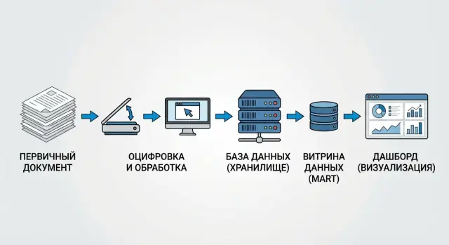
A map of the path: from original document to dashboard
To show the number’s path it helps to imagine it as a package: it has a sender (the original document), sorting centers (systems and data layers) and a delivery point (the dashboard). A good map answers two questions: where the number came from and what was done to it along the way.
The route usually starts with the original document: contract, invoice, payment order, acceptance act. It’s important to record not just number and date but the key fields that will later form the metric (amount, currency, counterparty, recognition date).
Next the data goes into source systems: ERP, accounting, CRM, HR. Differences appear already at this stage: different statuses (posted or not), different reference data, manual adjustments.
A practical data lineage map typically fits into four steps: source (where the original document and which system object is the truth), storage (how data is loaded into raw and cleaned), marts (which mart collects the metric and under which rules), BI layer (which semantic model, calculated fields and filters exist in the dashboard).
Simple example: in a “Monthly revenue” report the number comes from payments, but returns were excluded in the cleaned layer and the mart added a rule “recognize by act date”. In BI a filter “only paid” is applied. If these transformations are shown alongside the original documents, users quickly understand why their revenue differs from accounting and where it happened.
How to describe a metric so it can be traced
Tracing starts not with a tool but with a proper metric description. If “revenue” or “number of requests” live only in an analyst’s head, even the prettiest lineage on a dashboard won’t answer questions.
For each critical metric a short card is useful. Be specific:
- Owner: who is responsible for meaning and changes (role or person).
- Formula: how it’s calculated (including/excluding VAT, by payment or shipment) and for which period.
- Update frequency: hourly, daily, at close.
- Acceptable exceptions: what counts as an error and what is normal variation.
Then link the metric to sources and fields. Not “from ERP”, but “table X, field Y”. For each attribute mark the source of truth: payment date from the payment module, counterparty from the reference table, order status from CRM.
The most common weak point is transformations. Record cleaning rules (how you remove duplicates and choose the “latest” record), code mappings, joins (which keys you use) and filters.
Add control points: where and how you reconcile results. For example, “the sum of payments per day should match the accounting report within 0.5%”, and if it deviates an alert goes to the metric owner.
Step-by-step: how to show a number’s path in practice
Start with a small pilot. Choose one metric and one report where it’s used, and agree what you want to prove: where the number comes from, what transformations it goes through and who is responsible for changes.
A good pilot candidate is “monthly revenue” in a financial dashboard: the metric has many users and discrepancies usually show up quickly.
Then follow these steps:
- Choose one metric and one specific report (dashboard or table) where the user sees it.
- Collect the full list of sources and intermediate objects: original documents, extracts, tables, marts, BI models.
- Build dependencies both ways: top-down (from dashboard to sources) and bottom-up (from document to dashboard).
- Verify the chain on real data: take 2–3 rows from originals and manually trace how they become the metric.
- Record the result in the data catalog and change procedures so the chain doesn’t “break” after edits.
To make verification fast, prepare an “evidence pack” in advance: document ID, keys (number, date, counterparty), amount field, filter rule (e.g., only posted documents) and aggregation formula.
If a couple of rows don’t reconcile, the cause is usually one of three things: filters (something was excluded), reference data (attributes were redefined) or deduplication (records were merged). Better to catch this in the pilot than after the dashboard is published.
Common mistakes and pitfalls when implementing lineage
The most frequent problem starts not with tools but with meaning. If a metric has no single approved definition, teams calculate it differently: finance uses payments, sales use shipments, analysts use invoices. As a result lineage becomes an argument.
The second trap: lineage exists only at the table level. The diagram shows a mart built from several sources, but not which column came from where and where exactly a formula, filter or exchange rate was applied. For KPI this is critical: 2–3 lines of logic can move the result by percents.
Another trust breaker is manual edits in extracts. When someone “tweaked Excel before loading” or replaced values in CSV, the audit is broken: that step isn’t in lineage but the dashboard number is already different.
Check in advance whether you fall into these scenarios:
- the metric has no owner to confirm definition and changes;
- logic is kept in someone’s head or in messages, not next to the data;
- lineage shows the dataset path but not the path of specific fields and calculations;
- sources change (fields, types, references) without notifications or tests;
- “temporary” manual edits become permanent.
Example: procurement renamed a document status in the accounting system and the filter “only paid” stopped working. The report didn’t fail, it just “silently” shifted revenue. Without a metric owner and source-change tracking such a cause is searched for weeks.
Good practice is to assign data owners, store formulas and rules alongside metadata and require lineage at the column and calculation level, not only at tables.
What lineage features to look for in data platforms
When choosing a platform, look not at a pretty diagram but at how much manual work it removes. Good lineage is built from real processes and updates itself, not lives in a presentation.
Automatic collection and trace depth
The platform should pull relationships from your ETL/ELT, orchestrators and SQL so you don’t draw everything manually. Otherwise lineage will quickly become outdated as sources, schedules and logic change.
Check depth: you often need the path not only “table to table” but down to columns (which field from the original document became this column in the mart). Business users, in turn, want to see the reverse dependency: which reports, dashboards and metrics depend on this column.
On a demo ask to show three things: automatic lineage building from pipelines and SQL with regular updates; the link “column -> transformation -> metric/report” in both directions; a visualization that shows steps and filters, not only end nodes.
Glossary, versions and access
Lineage is useless without human names. You need search by terms and synonyms and a single glossary where “revenue”, “income” and sales map to one definition. In large organizations this removes many disputes.
Versioning is critical. It should be visible what changed, when and who approved it. Example: returns accounting rules changed and the KPI in the dashboard shifted. Without change history you’ll spend a long time finding where the shift occurred.
Finally, access control. Lineage must respect restrictions: who sees the full path and who sees only anonymized parts. It’s useful when the platform supports masking of sensitive fields without “breaking” the trace for auditors and data owners.
How to assess lineage quality: simple criteria
Good data lineage helps quickly answer: where did this report number come from, who and when changed it, and can it be trusted.
Evaluate by five criteria.
Accuracy: does it show real transformations or just arrows between systems? If lineage shows concrete steps (SQL, ETL rules, model formulas) you can explain discrepancies and find where they arose.
Completeness: does the trace cover the entire path—sources, storage layers and marts, BI, including calculated fields and measures? A common problem is clarity up to the mart, while the dashboard contains “grey zones” where KPIs are recalculated without control.
Timeliness: how quickly does the map reflect changes (new column, rename, new filter)? A simple test is to modify a formula or pipeline in a test environment and check how soon it appears in dependencies.
Usability: business users need clear names and step explanations (“from invoice we take amount without VAT”), engineers need details (fields, jobs, versions, owners). If only one group can use it, value for the company drops.
Auditability: can you export change history and evidence for reviews? It’s important to show not a “picture” but a chain of versions and proof of which documents fed the data in a given period.
Example scenario: why the "revenue" KPI suddenly changed
The CFO sees 1.2 billion in monthly revenue on the dashboard. The sales head shows 1.35 billion in their report. Both are convinced they are right because the numbers are “from the system”. This is a classic data lineage task: find where definitions and data diverged.
Often the first divergence is in the sources and document sets. Finance counts by closing documents and postings (recognition dates, returns, adjustments). Sales counts by shipments or invoices, sometimes by orders; some include VAT, others don’t exclude canceled deals. It’s important to list explicitly which operations are included: sales, returns, bonuses, discounts, adjustments, currency differences.
Next comes tracing through processing steps. The divergence is usually found in one of these places:
- rows were lost during loading (e.g., a filter by status “posted” cut out some documents);
- transformation logic changed (e.g., date taken from invoice rather than shipment date);
- a mart or dashboard filter is applied (e.g., some branches excluded);
- reference mappings differ (e.g., some sales assigned to a different legal entity).
When the divergence point is found, formalize the rule as a single KPI definition: formula, list of sources, inclusion conditions, date, currency, VAT, returns handling. At the same time set quality controls: reconciliations between layers (source -> mart -> dashboard), alerts on sharp deviations and completeness checks (how many rows were and how many remained at each step).
Short checklist before publishing a dashboard
Before publishing a dashboard run a quick check: can you explain any number so the business has no doubts? The check takes 10–15 minutes but saves days of post-release investigations.
Check five things:
- the metric has an owner (name or role) and a documented definition: what we count, in which currency and period, with which exceptions;
- it’s clear which sources are primary and which are derived (e.g., the invoice/act/transaction is primary, the Excel extract is not);
- key transformations are visible: filters, deduplication rules, currency conversions, reference mappings;
- there is an explanation with one example: one document and one row showing how it goes through loading, calculation and ends up in the target cell;
- before publishing there are quality controls, reconciliations with a canonical source and a change log so you can answer “when and why the number changed”.
Mini-check scenario: pick one invoice line for 100,000, find it in the mart by key, ensure it wasn’t filtered out, and see which step added VAT or converted currency. If at any step you can’t quickly show “where it happened”, don’t release the dashboard.
Also agree who approves logic changes. Even a small filter tweak without logging turns number questions into endless disputes.
Next steps: start small and scale
Don’t try to cover the entire data landscape at once. Choose 3–5 metrics that are most discussed in meetings and most often the subject of “mismatched numbers”. It’s easiest to demonstrate value on them: when the number’s path is transparent, disputes end noticeably faster.
A starter set of steps usually looks like: record the list of metrics and their official definitions (formulas, periods, exceptions), build an end-to-end chain “original document -> load -> storage -> mart -> BI dashboard”, set simple quality checks at key points (completeness, duplicates, anomalies), create a metric passport (owner, source, update frequency, where used), and agree how descriptions are updated with changes (releases, tickets, approvals).
Then assign roles. Without responsibility everything becomes scattered notes. Usually three roles suffice: data owner (sources and loads), metric owner (meaning and formula) and report owner (how the KPI is shown in BI). Then it’s clear who answers which part of “why did the value change”.
How to scale without overload
Scale in waves: first finance and sales, then operational metrics, then regulatory reporting. For example, if you’ve already traced “revenue” and “margin”, the next logical metrics are “accounts receivable” and “overdue share” because they often use the same documents and references.
At the same time build the foundation: data catalog and metadata, DWH, BI, quality controls and unified naming rules. If you need a partner to assemble the contour to your organization’s requirements and handle integration, this is handled by GSE.kz (gse.kz) as a system integrator, providing support and infrastructure solutions for corporate environments.
FAQ
What is data lineage in simple terms?
Data lineage is the description and visual “chain” of where the data for a metric came from and what transformations it went through before the report. It allows you to walk back from a KPI on a dashboard to specific documents, tables, fields and calculation rules to quickly find the cause of discrepancies.
Where to begin if our reports constantly "don't match"?
Start by locking down the official definition of the metric: formula, period, filters and exceptions. Then map each element of the formula to concrete sources and fields, and test the chain using 2–3 real documents to ensure the rules work as described.
How does data lineage differ from regular ETL documentation?
ETL documentation usually describes the loading and transformation processes at a general level, while lineage answers the user question “why is this number like this?”. Good lineage reveals the path of a specific KPI, including filters, joins, deduplication, currency conversions and BI calculations.
What lineage levels exist and why separate them?
The technical layer shows which data objects and pipelines were involved and how data moved and transformed. The business layer explains the metric’s meaning and calculation rules. The operational layer records when and by whom calculations ran, which code and reference data versions were used, and why a value might have changed today even if logic hasn’t changed.
What should be in a "metric passport" to make a KPI traceable?
The passport makes a metric verifiable and maintainable: it assigns an owner and a single definition and points to concrete sources. It should include the formula, period, update frequency, exceptions, the sources of truth for key fields and control points where results are reconciled.
Why do manual Excel edits so often break lineage?
Because part of the logic ends up “outside the system”: someone edited an extract, replaced values or renamed columns and there is no trace. Minimal protection is to remove manual edits from critical chains; if that’s impossible, record the author, date, reason and exact rules of changes next to the data.
How to quickly find why the "revenue" KPI differs between two reports?
The most common causes are different filters and document statuses, different recognition date rules, differences in VAT/discounts/returns handling, or different reference mappings. Lineage helps localize the discrepancy: where a rule was applied, which source is considered the truth, and at which step the metric's meaning changed.
What questions to ask on a platform demo to check lineage quality?
Ask to show the path “column → transformation → metric/report” in both directions and confirm it’s built automatically from your pipelines and SQL. Also check that calculations and filters in BI are visible, not just arrows between tables, and that there’s a history of changes with dates and responsible persons.
How to tell that lineage is actually working and not just "for show"?
Check whether you can explain any number using one document: where it entered storage, how it was cleaned, where filters applied, and how it reached the chart. Also ensure the dependency map updates quickly after changes and that there is a version history for audits and incident investigations.
Who should be responsible for a metric and for changes to its calculation?
Typically the metric owner (meaning and formula), the data/source owner (quality and loads) and the report owner (how the KPI is calculated and displayed in BI). With roles assigned, the question “why did the value change” goes to the right person and changes stop being silent.