Corporate Portal as a Single Entry Point: Structure and Access
Corporate portal as a single entry point: how to design sections, search, notifications and role-based access so employees can work easily.
Why make the portal a single entry point
When a company has many services, they almost always end up with different entry points. Email and calendar separately, HR requests separately, procurement separately, a knowledge base separately, CRM or service desk separately. Each has its own address, password, rules and sometimes its own support.
For an employee this becomes daily friction: where to find a form, where did the request go, why did access suddenly disappear, which login is correct. Time is lost, mistakes increase, and important requests can drown in correspondence or end up in the wrong system.
A single entry point is one familiar start screen from which a person reaches all necessary services. One login, clear navigation, unified search and transparent notifications. The portal works like a reception desk: it doesn’t have to replace every system, but it must quickly guide to the right one and keep the context.
It usually makes sense to gather what people use every day: requests (IT, facilities, passes, procurement, business trips), documents and templates, instructions and FAQs, important announcements, employee directory and support contacts.
Success is measured not by a “beautiful homepage” but by making life easier. Good signs: fewer “where to do this” questions in chats, fewer forgotten requests, a higher share of tasks created via the portal, and noticeably less time from request to result.
In companies with distributed support and multiple offices an employee should be able to do two things: open the portal and submit a request or create a ticket. If after launch people stop keeping their “list of links” and make fewer mistakes with recipients, you hit the target.
Roles and scenarios: structure starts here
It’s easier to design the portal structure from people, not menus. When the portal works as a single entry point, the employee doesn’t think where a service is — they solve the task in a minute.
First, list main user groups. Even within one company needs differ: office staff care about news and documents, branches need quick access to requests, managers need approvals and statuses, and IT, HR and finance need working forms and regulations.
Often a basic set of roles is enough to start designing: office and departments, branches and remote employees, managers, IT, HR and finance.
For each role list tasks a person wants to complete in 1–2 minutes. Avoid vague words like “communications”; use concrete actions: request access, find a regulation, approve leave, order equipment, check request status.
Also mark scenarios that often break a “beautiful” scheme and run them in advance:
- what needs to be done from a phone, without a laptop and long forms;
- how to access from home or on a business trip if there is no corporate network;
- what happens on a new employee’s first day;
- where approvals happen and who should see the status.
Don’t forget constraints. In real companies confidentiality and regulations matter: not everyone should see finances, personal data or procurement. Access rights are better built by roles and processes so an employee sees only what they need for work and approvals follow a clear chain.
Section structure: menu and homepage logic
The portal homepage should answer: “What should I do right now?” If there are 30 widgets on the screen a person gets lost and returns to familiar chats. Keep only what helps act. Put a “showcase” with banners and long news in a separate section.
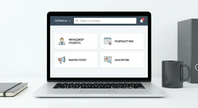
A practical rule: 5–7 meaningful blocks on the homepage. For example: search (single line, always visible), my tasks and approvals, quick actions (create request, request access, leave), important announcements (infrequent but noticeable), favorite services and support contacts.
Name top-level sections so they’re understandable without explanation or internal abbreviations. People usually need “Services”, “Requests”, “Documents and templates”, “News”, “Training”, “Directory”.
Group services by tasks, not by system names. It’s easier to search for “Business trips”, “Procurement”, “HR issues” than to remember which program handles a document. If you have different divisions (production, service network, office), it’s better to add a role filter than to build separate “menus for everyone”.
As a guideline, have 6–8 top-level menu items; put the rest in submenus and section pages. And agree on a single vocabulary: if one place calls it “Request”, another “Ticket” and a third “Inquiry”, people will think these are different things.
Search: one line for services, documents and knowledge
If the portal is the single entry point, search becomes the main button. People usually want not to figure out where something is but to quickly find it and act: open a form, submit a request, message the responsible person.
Search should find everything that helps solve a task in 1–2 clicks: documents and templates, instructions and knowledge base, services and requests, people and teams.
It’s important that queries work in natural language. An employee might type “leave”, “time off”, “annual”, “leave schedule” and expect the same result. Prepare synonyms and key phrases in advance, account for abbreviations and internal names.
Filters should be described in simple words and actually narrow results. Usually enough: type (document, instruction, service, person), department, topic, date.
Make results useful, not just a list of titles. Cards with a short description, owner and update date work well. Include quick actions there: “Create request”, “Download template”, “Open instruction”, “Message owner”. Search suggestions also help: they teach how to phrase queries and save time.
Notifications without noise: rules and settings
Notifications should help act, not distract. If an employee gets dozens of identical pings, they stop reading and miss important ones.
Keep mandatory only events that require action and have a risk of missing a deadline: a task was assigned, a comment arrived on your request, approval is needed, a deadline is approaching. Everything else — news, directory updates, general announcements — is better as subscriptions or a digest.
Separate channels by purpose. In-portal notifications suit everyday work, email is for things that must be seen outside the portal, messenger only for truly urgent matters.
To avoid duplication, choose one primary channel per event type and leave others as options. Let users set simple preferences: frequency (immediate or digest), importance, subscriptions to topics and projects. A useful practice is “quiet hours”, when only critical notifications come through.
Process owners need clear mailing rules. A common mistake is emailing “everyone” out of habit. If you start a new procurement process, notify only participants: the initiator, approvers, finance. Others can receive a news item or digest.
Tone and format matter. A message should be short and answer “what to do”: who asks, what changed, what’s the next step and by when.
Access rights: how to divide by roles and not get confused
The main rule is simple: give access only to what a person needs to work here and now. That reduces accidental leaks, unnecessary questions and the risk of seeing data the employee is not responsible for.
Start from roles and typical tasks, not from “folder permissions”. Usually a few basic roles and groups can be combined: employee (self-service and requests), manager (approvals and reports for their team), HR, IT, finance, external contractors (only what relates to their project). The fewer unique roles, the easier the support.
Protect areas with high cost of mistakes especially strictly: personal data, financial documents, contracts and commercial terms. For these sections define who can view, who can edit, who can export files, and whether an action log is kept.
Don’t mix service access and data access. An employee can open the “Procurement request” form, but that doesn’t mean they should see the department budgets or all contracts. The service enables an action; data should be revealed by separate rules: “only own”, “only own team”, “only own project”.
To avoid drowning in exceptions, formalize them as clear processes: temporary access for a set period (with automatic revocation), substitution during leave or illness, access by task with manager confirmation, special rules for contractors limited by project, and a regular review of “who has what” at least quarterly.
Example: when new workstations and servers are deployed (as often happens at GSE.kz in integration projects), a contractor can be given the section “Project requests and approvals”, while payment data and employee personal data remain closed. The portal stays a convenient entry point and doesn’t turn into a “shared folder for everyone”.
Single sign-on and account management: what to plan in advance
If the portal should save time, start with single sign-on. Ideally an employee has one account and one password, and the portal grants access to needed services by role. But sometimes a simpler approach is enough: a single portal account, while critical systems (for example finance) keep separate authorization.
A simple test: what happens when a person joins, changes position or leaves. The fewer manual steps for admins and managers, the fewer errors and “forgotten accesses”. In a good scheme accesses are granted and revoked by rules, not by email.
Employee lifecycle
Plan events that should trigger automatic changes:
- hire — create account, assign role, open basic sections;
- transfer — change permissions and subscriptions, revoke some accesses;
- temporary substitution — grant access for a period and then revoke automatically;
- dismissal — block account, revoke tokens, transfer active requests;
- contractors — minimal access, strictly time-limited and scoped to specific sections.
Transparency and risk reduction
Even with automation keep a trail: who requested access, who approved, when it was granted and when revoked. Logs help investigate incidents without guessing and allow the security team to respond faster.
For branches it’s important rules are uniform: one role directory, shared groups, one approval procedure. Then a new office doesn’t become an “island” with manual exceptions.
To prevent risks from accumulating appoint section owners and schedule regular access reviews (for example quarterly). The owner confirms who still needs access and unnecessary rights are closed without conflict.
How to design the portal step by step
A working structure appears when you first fix what employees do daily and only then decide where it sits in the menu and how to search for it.
A basic plan in five steps:
- List services and typical tasks by role. Not “HR” but “order a certificate”, “submit leave”, “view schedule”.
- Sketch the menu and homepage on one sheet. Keep 6–8 most frequent actions and status widgets on the homepage ("my requests", "awaiting approval").
- Describe search: what exactly we search for and how results look. Decide whether services, documents and knowledge mix in results and which filters are needed immediately.
- Plan notifications and subscriptions. Define what is urgent (downtime, security, approvals) and what is better collected in a digest.
- Map access rights by roles and check exceptions. Better 5–7 clear roles than dozens of tiny permissions that no one can maintain.
Then launch a pilot in 1–2 departments. Start with HR requests and IT tickets: these quickly reveal where search fails, which notifications annoy and which accesses hinder work.
Before rolling out company-wide check three things: is the homepage clear to new people, are answers found in 10–15 seconds via search, and do important notifications stand out from the noise.
Common mistakes when launching a corporate portal
Mistake number one — trying to show everything at once. When the menu lists dozens of similar items like “Requests”, “Services”, “Support”, people don’t know where to click and revert to email or messenger.
Search often suffers: it searches only documents and not services, so the needed form isn’t found. An employee remembers “there was an access form somewhere” but search returns nothing. If the portal doesn’t find services, process cards and knowledge base answers it stops being an entry point.
Another common problem is notifying “everyone at once”. People get noise: news, requests, reminders, comments. Within a week they turn everything off, including important approvals. Agree in advance on rules: what is critical, what goes into a daily digest, and what is shown only to subscribers.
Accesses get messy when granted manually without owners and expiry. In a few months former employees still have access, temporary roles become permanent and responsibility blurs.
Finally, the homepage often becomes a news feed. Ensure the first screen contains quick actions: create request, open a popular service, find an instruction, view your tasks. An accountant needs “Approve invoice” and “Document templates” more than the third news item of the day.
Quick checklist before launch and after the first weeks
Before launch the portal should answer: can an employee do the most frequent action in 30 seconds and understand what to do next?
Before launch (3–7 days prior)
Test the portal with different people, not just the project team. Short 10-minute tests per person work best.
- The homepage shows 5–7 most common actions for key roles (employee, manager, HR, finance, IT).
- Search finds at least three things: a document, a service (request), an instruction or contact, and it’s clear why they appear.
- A notification is readable without context: what happened, where and what the next action is.
- Roles and section owners are described: who is responsible for content, access and relevance.
- Lifecycle scenarios are covered: new hire, temporary substitution, dismissal (what is blocked, what remains, who confirms).
After the first 2–3 weeks
Collect facts, not impressions: what people search for, where they abandon requests, which notifications are ignored.
- There is a simple feedback channel (button or form) and a person who responds within a clear timeframe.
- Weekly short reviews: top-10 search queries, top-5 questions, top-5 “dead” pages.
- Menu and homepage are adjusted based on data: what to promote, what to remove, what to rename.
- Access rights are spot-checked: 10 employees from different roles and 10 critical sections.
A good sign is when new employees don’t ask “where to go” and start acting immediately.
Example scenario: from request to approval in one place
A branch employee plans two weeks of leave and simultaneously requests access to an internal system needed to wrap up tasks before leave. Ideally they don’t send emails to HR and IT or search for “that form” in an old folder.
They open the portal, see the familiar homepage and type “leave” in the search. The result shows a service card “Leave application” with a “Create” button and a nearby hint “System access: request permissions”.
The process proceeds in steps but looks like one story to the user. They enter dates, select a substitute and indicate which system access is needed. After submission the screen shows status and an expected resolution time, e.g. “Manager decision — up to 1 business day”.
Notifications come only when relevant: submission confirmation, request for clarifications, decision at each stage. The employee sees progress, not a thread of messages: what is done and who is next.
For roles it looks like this:
- Employee: a single “My requests” list, statuses and deadlines.
- Manager: approval queue with “Approve/Return” buttons and comments.
- HR: absence calendar and final processing.
- IT: a task to grant access with required fields and deadlines.
Result — fewer emails, fewer “lost in chat” cases, more transparency. If something is delayed you see exactly where, not “someone didn’t answer”.
Next steps: how to move from a scheme to a working portal
When roles and the scheme are clear, don’t try to launch everything at once. Value appears faster if you start with a few clear tasks and make them comfortable for daily use.
Make a short list of most-used items: requests, approvals, documents, knowledge base, support. Then choose 3–5 processes for first release. A good sign: each process has an owner, measurable results and regular users.
Then plan simply:
- Fix the first version of the menu and homepage: what is visible to everyone, what is role-based.
- Assign section owners (content, relevance, publishing rules) and a person responsible for notification rules.
- Prepare a 2–4 week pilot: one or two teams, real tasks, weekly feedback collection.
- Provide short role-based training: employee, manager, HR, IT. Twenty minutes of practice is better than an hour-long presentation.
- Agree on support: who handles accesses, who handles outages, response times and how changes are approved.
Plan infrastructure even for the pilot: backups, monitoring, a clear update window and capacity for user growth and search load.
If you involve a contractor, split responsibilities: the business owns processes and rules, the integrator handles implementation, integrations and stability. GSE.kz (gse.kz) usually connects on system integration and infrastructure — from server base to support — so the launch isn’t blocked by performance or support issues.
After the pilot decide what goes into the first working release and what moves to the second wave. This keeps momentum and user trust.
FAQ
What does a portal as a single entry point give if systems are still different?
A single entry point lets an employee start work from one familiar screen and not keep dozens of addresses, passwords and “where to write” in their head. The portal does not have to replace all systems, but it must quickly lead to the right place, show statuses and prevent requests from getting lost.
Should I start the portal structure from the menu or from roles?
Start from roles and 1–2 minute tasks: what a person wants to do quickly without searching or writing messages. For each role, list 10–15 most frequent actions, then test scenarios that usually break: using a phone, accessing from home, the new hire’s first day, approvals and status visibility.
What elements really should be on the homepage?
Keep only what helps act immediately: search, “my tasks”, quick actions, important announcements and support contacts. If the homepage becomes a showcase of dozens of blocks, people return to chats and bookmarks because they don’t know where to click.
How to name sections correctly and avoid confusing people?
Names must be clear without internal abbreviations or system names. Group services by the employee’s tasks, not by how IT organizes them: “Leave”, “Purchases”, “Accesses”, “Business trips” are usually clearer than internal program names.
What should search be like so the portal actually saves time?
Search should find not only documents but also services, instructions, people and process entry points. A good result immediately suggests the next step: open a form, create a request or message the responsible person. Synonyms and common phrasing help return the same result for different words.
How to configure notifications so there’s no noise?
Keep mandatory only the notifications that require an action and have a risk of missing a deadline: task assignment, comments on your request, approvals, approaching deadlines. Everything else is better moved to subscriptions or a digest, otherwise users will turn everything off and miss important messages.
How to divide access by roles and not get lost in exceptions?
Build access from roles and typical tasks, not from individual folders and rare exceptions. Give people only what they need for work, be especially careful with personal data and finances, and record who requested access, who approved it and when it should be revoked.
Is single sign-on (SSO) necessary or can we live without it?
Ideally, an employee has a single account and the portal opens the needed services by role to avoid multiple passwords and manual settings. If full single sign-on is not possible immediately, start with a portal account and gradually connect other systems, leaving separate authorization only where risks justify it.
What must be planned for account management throughout an employee’s lifecycle?
The most important thing is the lifecycle: hiring, transfer, temporary substitution and dismissal should trigger clear changes to accesses. If these events are handled by rules, not by email threads, there are fewer errors, fewer forgotten accesses and less burden on admins, and the approval history remains transparent.
How to roll out the portal in stages and how to measure success after launch?
Pilot on 1–2 departments and on processes where the effect is quickly visible, for example IT requests and HR forms. Measure success practically: how many tasks are created through the portal, how long it takes from request to result, whether there are fewer “where to do this” questions and fewer lost requests.