Choosing a Monitor for Designers: Procurement Mistakes by PR and Design Teams
Choosing a monitor for a designer: common mistakes by press offices and design teams, how to check color, resolution and avoid overpaying.
The problem: office panels vs. color and layout tasks
An office monitor is usually chosen for spreadsheets, email and video calls. Price, brightness and "it just works" matter more there. For photos, mockups and print it's a different job: the screen must show predictable color, smooth gradients and a stable image across the whole area.
When typical office panels are bought instead, complaints appear fast. At first it seems "fine", then differences with phones, laptops, print or a colleague's screen emerge. In the end both the choice of a monitor for a designer and trust in the result suffer.
Common complaints repeat: "the color didn't match" (skin looks greenish, the brand red turned brick), "the layout shifted" (spacing and grid look different on another screen), "small text hurts the eyes" (you have to zoom and lose precision), gradients show banding, and edges become noticeably darker or warmer.
Confusion is amplified because the press office and the design team often speak different languages. The press office cares about speed, readability, eye comfort and uniform workplaces. Design needs color gamut, stable hues, detail and the ability to calibrate so mockups look the same at every stage.
The risks of a wrong purchase are not only cosmetic. Rework and extra approvals, missed publication deadlines, disputes with vendors and print shops — sometimes brand damage when corporate colors look inconsistent across releases and materials.
Different needs: press office vs. design team
The press office sees the monitor as a "showcase": photos for the site and social media should look pleasant, presentations must be readable, and edits done quickly. Print happens occasionally: one-off mockups or approving finished materials.
The design team lives in another mode. Layout, retouching, branding and precise work with fonts, grids and small details matter. The same mockup goes through dozens of iterations, and the monitor becomes part of the "measuring tool", not just a screen.
That's where procurement conflicts arise: the press office thinks the "picture looks fine", while designers spot gradient failures, "shifting" skin tones and varying brightness at the edges. Complaints appear after delivery, when it's too late to change.
However there is common ground: stable color without surprises when you change viewing angle, even backlight, eye comfort for long work sessions and predictable behavior across applications.
Before approving a purchase, agree on tasks with simple questions. Will the result live mostly on screen (site/social) or in print? Is regular retouching and work with brand colors required? How many people will open the same file and compare results? How critical are small text, grids and exact spacing? Who accepts the final "color match"?
You can save money where the monitor is mainly for reading, presentations and basic image prep. But if a designer retouches photos for public materials and assembles mockups often, an "office panel" tends to cause rework: one screen shows a flat gray, another shifts it green, and edits cycle round and round.
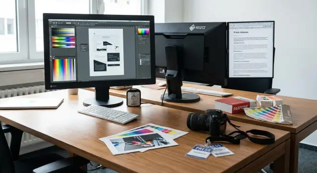
Basics: size, resolution and eye comfort
For layout and photo work it's not just "bigger diagonal", but how the workspace fits panels, program toolbars and text without constant zoom. A common procurement mistake is buying a 23–24" office model, then designers live with constant scrolling and zooming.
Diagonal and resolution work together. 27" at a higher resolution typically gives more usable space for grids, columns and previews. A big screen with low resolution looks "big and soft": retouch details and thin lines in a mockup are harder to read, forcing zoom.
Next layer — pixel density and scaling. With many pixels, UI and fonts can become too small, and people set scaling to 125–150%. That's fine, but check in your apps (InDesign, Figma, Photoshop) and OS that text stays crisp and UI elements don't "jump" sizes. Otherwise a great screen becomes a constant compromise: high quality but hard to read.
Eye comfort also depends on the panel. Wide-angle panels change image less when you look from the side or lean in. Weak panels can make a gray look different at the edges, and you start fixing things that aren't in the file.
Before buying check basics in person (or request a supplier test): can you read 9–11 pt text in a mockup without extra zoom, does a gray background look the same in the center and corners, do thin lines and small elements stay sharp, is there flicker or eye strain after 30–40 minutes, and how does the screen behave under office lighting.
Surface finish matters too. Glossy looks "bright and vivid" but catches window and lamp reflections, increasing fatigue and causing contrast assessment errors. A matte screen is usually calmer in a typical office, especially when desks are near light sources.
What matters for color: gamut, gradients, uniformity
For photo, branding and layout work, "bright and punchy" guarantees nothing. Measurable things matter: what color range it shows, how it handles smooth transitions and how evenly it lights the panel.
Gamut answers which colors are available. For most press and web tasks good sRGB is enough. For print, complex retouching and saturated images a wider gamut (Adobe RGB or DCI-P3) helps — but only if the rest of the workflow uses correct profiles and control. Otherwise "rich" colors on screen become surprises in PDFs or print and complaints follow.
Gradients are simpler: if a monitor struggles with midtones you'll see "steps" in skies, shadows and skin. This often relates to color depth (8-bit vs 10-bit) and how the panel simulates missing shades (FRC). Before procurement ask to show test gradients on neutral gray and color ramps, not just promotional photos.
Backlight uniformity affects how you judge white, gray and skin tone. If corners have "spots" or an edge is warmer, you'll end up correcting the monitor instead of the photo. This is especially visible in layout: two identical solid blocks can start to "drift" visually.
Another trap is factory modes. "Bright and vivid" usually means boosted brightness, cool white and oversaturated colors. For work you need a calm mode with manual controls and predictable results.
Before deciding check: claimed gamut (sRGB, Adobe RGB, DCI-P3) matches your tasks, gradients without banding or noisy patterns, even white/gray across the panel, precise brightness and color temperature controls, and image stability when viewing angle changes.
Calibration and profiles: getting consistent color everywhere
Calibration is required so a monitor shows predictable color, not just "nice". It's not the same as tweaking brightness and contrast. Manual adjustments change the picture "by eye" but don't provide a stable white point, correct gamma or smooth gray tones. As a result the same mockup looks different across workplaces and arguments start about screens rather than design.
Procurement often overlooks this: they pick diagonal and "4K" but ignore color management. The typical outcome: the press office views a photo on one monitor, a designer edits on another, and after publishing or printing complaints about "too yellow" or "blown-out" skin start.
Profiles (usually ICC) handle the other half: they tell the system how this monitor actually reproduces color. Without a profile even a good display will behave inconsistently across applications, and two identical models may differ due to unit variance. It's important that the profile is installed system-wide and used by color-critical applications (layout, retouching, previewing).
If office lighting changes (you move desks closer to a window, install new lamps, start working evenings), perceived color changes too. So recalibration should be regular: for active photo work roughly every 4–8 weeks and always after noticeable lighting changes or renovations.
To avoid chaos you need a minimal setup: one person responsible (IT or senior designer), a colorimeter (one per department is usually enough), a clear check schedule, unified target settings (brightness, white point, gamma) for all workstations, and a place to store profiles and calibration records (shared folder or IT documentation).
A practical rule: if color matters, calibration is not a one-time "setup at purchase" but a regular procedure that saves time on rework and approvals.
How to choose a monitor step by step to avoid procurement mistakes
Start with tasks, not brand or price. The press office values speed, readability and stability. Designers need color fidelity and detail. Mixing these requirements in one procurement without rules almost guarantees complaints.
Write a short task description: what is done most often (web banners, print mockups, presentations, basic photo editing, video editing) and how many hours per day the monitor will be used. The same "office" screen might be fine for text but fail on gradients and neutral grays.
Decide on the workstation layout. Sometimes one large screen is better, sometimes two identical monitors. For layout portrait orientation can be useful, so choose a stand with rotation or a mount.
To keep monitor selection from turning into a taste argument, agree in advance how you'll check color. Who is responsible for calibration, is there a colorimeter, and must every workstation show the same image? This should be part of acceptance, not a "later" task.
Practical action list:
- Record tasks and priorities (web/print/presentations/video) and expected daily hours.
- Decide format: one screen or two, need for vertical orientation.
- Fix color and calibration requirements (who checks and what settings are used).
- Request a test before bulk purchase: gradients without banding, even gray fields, consistent brightness in corners, sharp small text.
- Approve acceptance rules: what counts as a defect (dead pixels, backlight bleed, noticeable non-uniformity) and at what brightness level tests are done.
A common example: a designer made a mockup with a soft gray background that looked even on a "simple" monitor. In print and on colleagues' screens banding and a greenish tint appeared, and the mockup had to be redone. A short gradient and gray-field test before buying usually prevents such risks.
Typical procurement mistakes and traps
The most frequent mistake is choosing a monitor by diagonal and price like any other office hardware. That often works for email and spreadsheets but fails for photos, layout and brand colors, leading to rework and complaints: "it looked one way on screen and different in print."
The second trap is assuming "IPS automatically means good for design." IPS only indicates panel type, not how even the backlight is, how gradients behave or whether there are tint shifts at the edges. Specific parameters and unit testing matter more.
Third scenario — demos in stores or showrooms. Screens are often cranked to maximum brightness to look "vibrant". In the office at normal lighting this becomes eye strain, too-bright whites and the feeling that the monitor got worse.
Ports and cables are often underestimated. The result can be oddities perceived as defects: flicker, limited refresh, wrong resolution, docking-station issues and laptop compatibility problems.
Before procurement and acceptance check basics: which inputs you actually need (HDMI, DisplayPort, USB-C), whether the required resolution and refresh are supported on those inputs, is there a unified rule for brightness and color temperature, how calibration will be done and profiles stored, and who verifies uniformity and gradients.
The last trap is mixing different models in one department because they were "what was available." Even if they are "roughly the same," without common profiles and settings people will see different skin tones, gray and brand colors. In the press office this leads to arguments with design; in design it leads to manual adjustments to match the "worst" screen.
If procurement goes through an integrator, include these checks in acceptance procedures. For large organizations this avoids conflicts between departments and repeated purchases.
Quick acceptance checklist before deployment
Acceptance is as important as selection. A good model can arrive with a bad unit, and office lighting reveals problems you didn't see in-store.
Test the monitor in the room where it will be used and let it warm up 15–20 minutes. Set native resolution, disable enhancers like dynamic contrast and auto-brightness, and set brightness to a comfortable working level (usually mid, not max).
A 10–15 minute check that saves days of rework:
- Gradient: open smooth black-to-white and blue-to-green ramps. Look for banding, steps and harsh breaks.
- Gray field: check for pink, green or yellow tint at the edges and corners on an even gray.
- White field: dirty spots, blotches and backlight non-uniformity show on a white screen. View at normal working distance, not up close.
- Real mockup with small text: open an actual file (press release, magazine, landing page) with 8–10 pt text and thin lines. Judge sharpness, comfortable scale and whether eyes tire quickly.
- Reflections in your lighting: turn on ceiling lights, desk lamp, open blinds. If reflections interfere, it will only get worse.
Example: you accepted a monitor "by appearance" and a week later the designer sees banding, the press office complains about "dirty white," and everyone argues whose file is "right." These disputes usually end with a return or a second purchase.
If something worries you, document it immediately: photo of the screen, the same test images on two monitors side by side and a short problem description. That makes replacement easier before equipment is distributed.
How to write a specification so you get exactly what you need
A good spec starts with tasks, not brand. Say if the monitor is used for photo editing and mockup preparation, and that results are checked by a calibration report. This turns debates from taste to verifiable parameters.
Include straightforward requirements: what you do, how you check and acceptable deviations. For example: "monitor used for photo editing and layout" and "results verified by a calibration report." This makes acceptance objective.
Useful specification items that cover most risk:
- Diagonal and resolution (e.g., 27" and 2560x1440 or 32" and 4K so layouts fit without constant zoom).
- Panel type and color gamut (IPS or equivalent, gamut at least 100% sRGB; specify Adobe RGB if print is required).
- Image quality (10-bit or 8-bit + FRC, backlight uniformity, no visible banding on gradients).
- Ergonomics and connectivity (height, tilt, rotation to portrait, needed ports: DisplayPort/HDMI/USB-C).
- Warranty and service (terms, pixel defect replacement policy, response times).
Specify calibration separately: who performs it (supplier, your IT or a contractor), with what tool (colorimeter), target settings (e.g., D65, gamma 2.2, 120 cd/m2), and require an attached report: date, device, target values and final metrics (e.g., average Delta E).
To avoid disputes at acceptance, agree the test procedure in advance. State you will check monitors within the first days after delivery: gray-field uniformity, no flicker at working brightness, correct connection on the required interface and the presence of a calibration report.
Example: buying "27-inch IPS" without calibration and uniformity requirements resulted in two designers getting banners with different tones. A spec with clear checks stops such issues before delivery.
A real-world example: how office monitors cause rework
In one organization the press office asked for "the same as the designer." It sounded simple: "we need photos and mockups to look nice." Procurement checked prices and bought ordinary office panels: standard panels, basic presets, no uniformity testing and no calibration. On paper everything looked logical: suitable diagonal, acceptable resolution and warranty.
Problems began after a few weeks. The same photo looked different across workstations: in some places skin shifted yellow, in others cold gray. The designer prepared a layout and the press office approved it, then leadership asked: "why does the site look different from print?" The print run showed banding and "dirty" shadows. The source files had to be reworked and approval restarted.
It turned out the issue wasn't a "bad designer", but that office monitors vary a lot and behave unpredictably on midtones. Everyone also adjusted brightness and saturation to personal taste, and the team lost a common reference.
They fixed it without magic but with discipline. First they agreed unified requirements for layout and photo monitors, then selected test images (portraits with varied skin tones, gray gradients, dark scenes, brand colors). After delivery they calibrated and accepted monitors using those tests and locked reasonable settings.
They formalized rules now checked before purchase: who works with color versus who needs text and tables; minimum color accuracy and uniformity; mandatory test images for acceptance; who calibrates and how often; and what counts as a defect and reason for replacement.
When procurement uses a systems integrator, it's easier to include these items in supply and acceptance to avoid subjective disputes.
Next steps: organizing procurement without conflicts
Conflicts usually start because everyone assumes tasks are the same. The press office values readability and speed. Designers and layout people need predictable color and comfortable mockup work. First step — map needs by workstation instead of hunting for a single "universal" model.
Make a simple list: who sits at which desk and what they do daily. This quickly shows groups: office desks, layout stations, photo/color-correction stations. This resolves half the arguments before budget discussion and makes choosing a monitor for designers sensible.
Next, run a short pilot: test 1–2 models and accept them using your checklist (fonts, gray gradients, backlight uniformity, connectivity, behavior in real mockups). A week-long pilot costs less than a month of rework and complaints.
Practical steps:
- Group workstations by task and fix minimum requirements for each group.
- Plan a pilot and decide who signs acceptance (design + IT + procurement).
- Assign responsibility for calibration and profile storage so color doesn't "drift" month to month.
- Agree replacement rules: what happens if a monitor fails checks or a unit from the batch differs.
- If updating many workstations, procure as a kit: PC/workstation, monitor, peripherals and basic setup.
Example: giving the layout team office panels "like everyone else" meant mockups only looked correct on one screen and print/site suffered. A pilot and unified calibration rules usually eliminate that risk.
If you need help with a comprehensive refresh, the systems integrator GSE.kz (gse.kz) can kit out workstations and handle deployment and support so all departments follow one standard and avoid time wasted on color disputes and acceptance.
FAQ
Why can an office monitor be "unsuitable" for design and layout?
A typical office panel often works fine for text and spreadsheets but can surprise you with photos and layouts: gray shifts, banding in gradients, and colors shifting at the edges. For design you need a monitor that shows predictable color and an even image across the whole surface.
What matters more to the press office versus the design team when choosing a monitor?
If the output is mainly for websites, presentations and social media, a good sRGB coverage and a stable image without obvious gray shifts is usually enough. If you regularly prepare materials for print or work with brand colors, build stricter requirements for accuracy and calibration upfront; otherwise rework and disputes will start.
How to choose diagonal and resolution so you don't live in constant zoom?
For layout and mockups, 27" with a higher resolution is often more convenient so panels, toolbars and the workspace fit without constant zooming. A large diagonal with low resolution looks "blurry" and forces you to zoom in to edit details.
How to know if pixel density and scaling suit you?
Open a real working file and check if 9–11 pt text is comfortable to read without straining or excessive scaling. If fonts are sharp and your eyes don't get tired, scaling is acceptable; if the UI breaks or elements become too small, reconsider the resolution/scale combination before purchase.
Do I need a wide color gamut or is sRGB enough?
Color gamut determines which colors the monitor can display. For most web tasks sRGB is enough. A wide gamut (Adobe RGB or DCI-P3) makes sense when you have color-managed workflows and control across the chain; otherwise "rich" colors on the screen become surprises in files or print.
Where does banding on gradients come from and how to check for it?
Banding on gradients appears on smooth transitions like skies, shadows and skin tones and indicates issues with midtones. Before buying, ask to show test gradients and neutral gray fields: promotional photos can hide defects, while gradients reveal them immediately.
Why is backlight uniformity so important for layout and photo work?
If backlight uniformity is poor, white and gray areas at the edges become darker or shift warm/cool, and you end up "editing the monitor" instead of the file. This is especially noticeable on solid color panels and backgrounds, so check uniformity during acceptance under your office lighting.
Why is calibration needed and what do ICC profiles do?
Calibration is needed so a monitor shows predictable color, not just a "pleasing" image. An ICC profile tells the system how that specific unit reproduces color. Without it even a good display can behave differently in different apps and between two nominally identical models.
How to organize calibration in the office without extra bureaucracy?
Usually one responsible person, one colorimeter per department and a clear schedule of checks are enough. For active photo work recalibrate roughly every 4–8 weeks and always after noticeable changes in lighting, so the team doesn't argue about "yellow" or "cold" tones due to different settings.
What must be checked at acceptance to avoid returns and disputes?
Check the monitor in the room where it will be used, let it warm up, set native resolution and a comfortable working brightness (not max). Open gradients, gray and white fields and a real layout with small text: if you see banding, dirty areas or a strong tint at the edges, document it and request replacement before deployment.